Get in touch
Tell me a bit about your project and I'll get back to you by email.
Tell me a bit about your project and I'll get back to you by email.
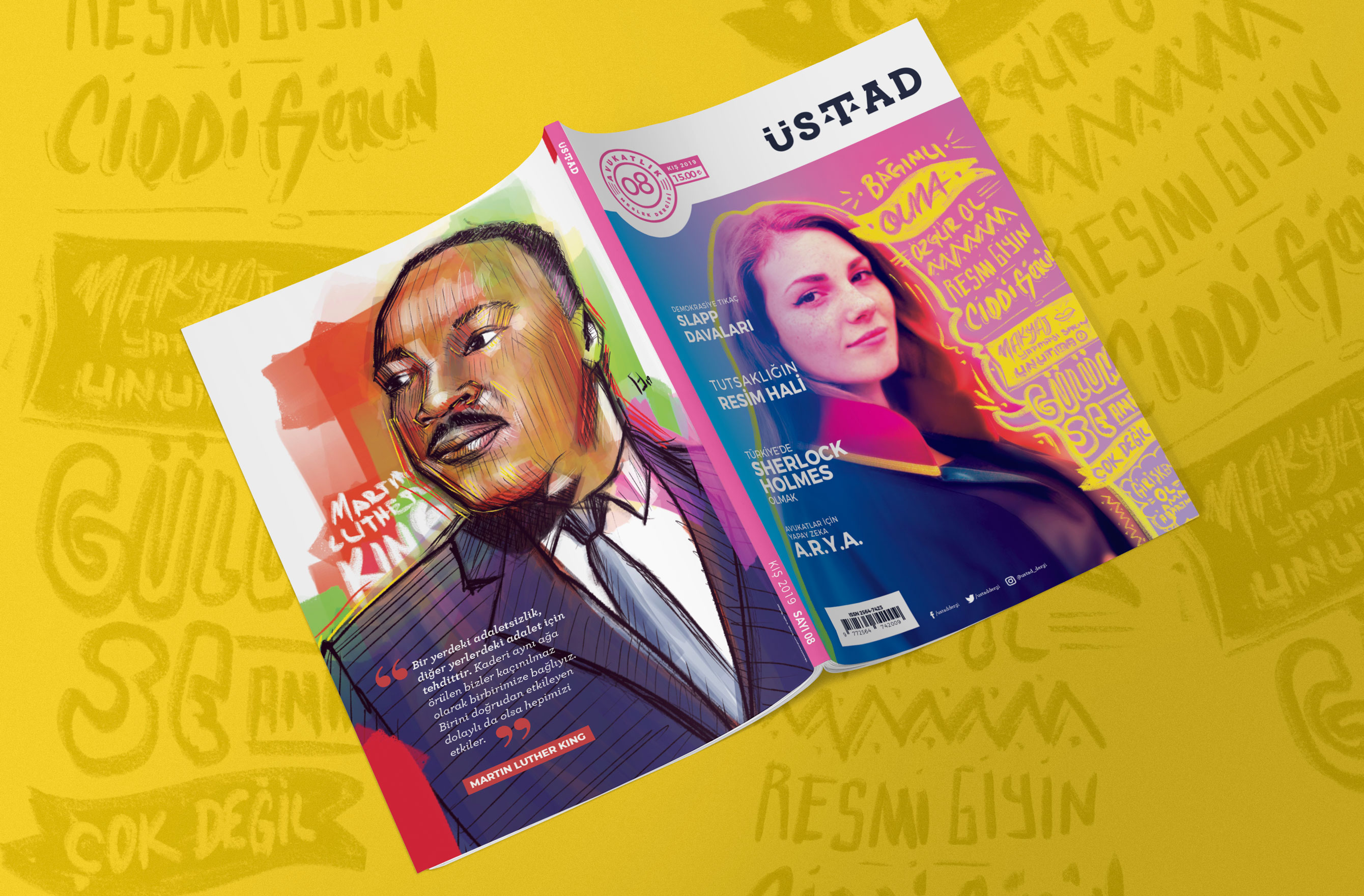
A quarterly magazine for Turkish lawyers. Twelve issues, every interior page and every illustration — a deadline that came round four times a year and never moved.
Client
Üstad — Avukatlık Meslek Dergisi, a professional quarterly for lawyers, sold on newsstands across Turkiye
Role
Sole designer and illustrator — covers, all interior pages, and the artwork for every article.
Cadence
Four issues a year, roughly 80 pages each, across twelve consecutive issues
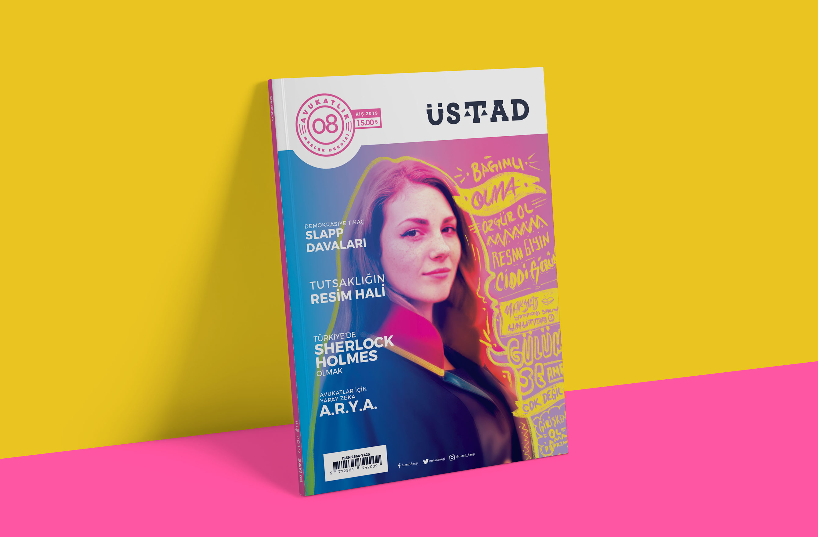
Legal writing is dense, unillustrated and mostly unread. The job was to make lawyers want to read their own profession's magazine.
A typical Üstad article arrives as eight thousand words of Turkish legal prose with no images, no pull quotes and no obvious entry point. The subject matter is genuinely interesting — a case about muzzling journalists, prison wall drawings, artificial intelligence arriving in a courtroom — but nothing on the page said so.
So every article needed a way in: an image that carried an argument, a piece of display type that gave it a voice, and a spread that told you how long the read would be before you committed to it.
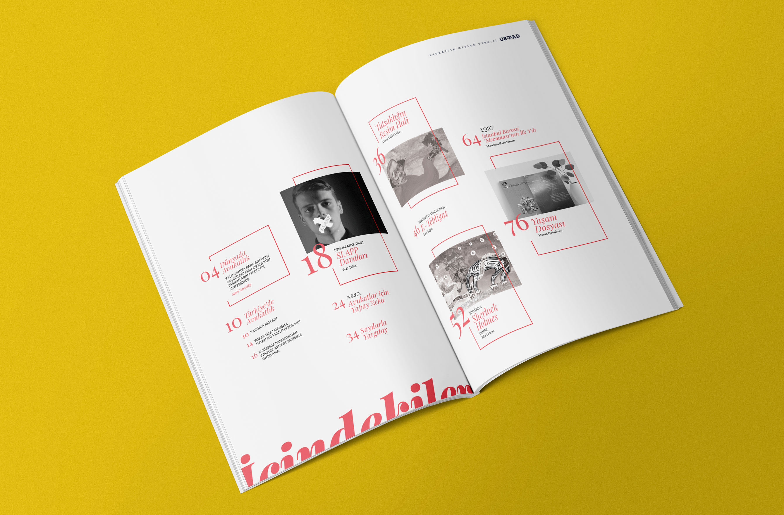
The contents spread. Page numbers do the navigating, thumbnails do the selling, and the word İçindekiler runs off the foot of the page.
Fig. 01
Four issues a year, alone, means the system has to make the decisions I don't have time to make twice.
One serif for display and one grotesque for labels, both carrying Turkish diacritics properly — the dotted İ, the ğ, the ş — because half of the display type is set in words that break in a font that doesn't. A fixed grid, a fixed set of opening-spread patterns, one rule for pull quotes, one rule for captions, one rule for the running head.
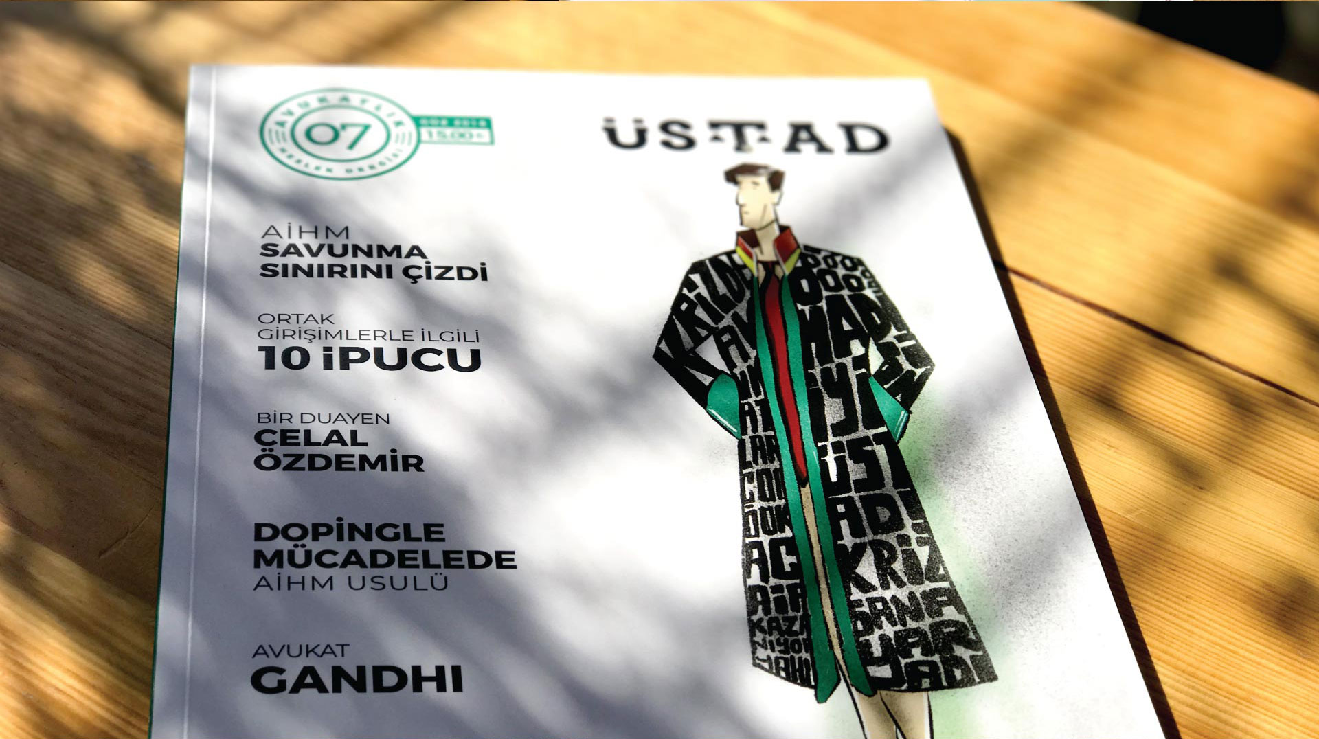
Each issue then gets a single accent colour that runs through every section marker, quote mark and folio in that issue. It is the cheapest possible way to make twelve issues feel like a series and each one feel new, and it meant the press could be given a two-colour job when the budget demanded one.
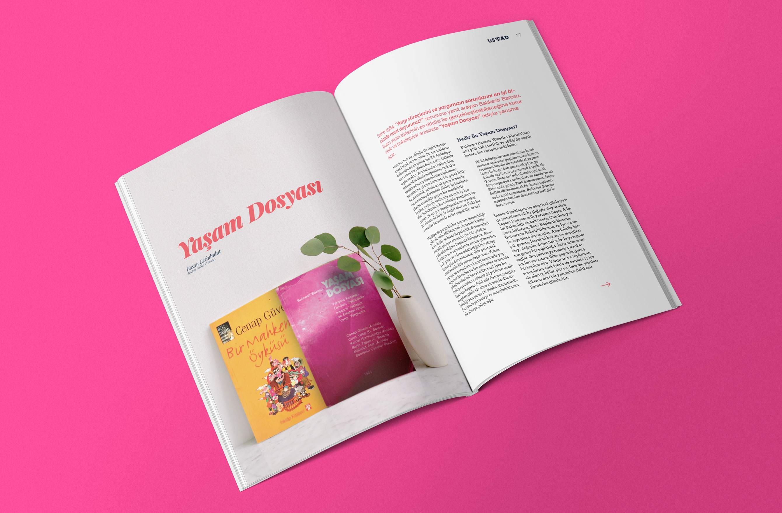
The photograph is a composite I built — a 1985 competition anthology and an Aziz Nesin paperback dropped into a shot of other books, lit and shadowed to match.
Fig. 02
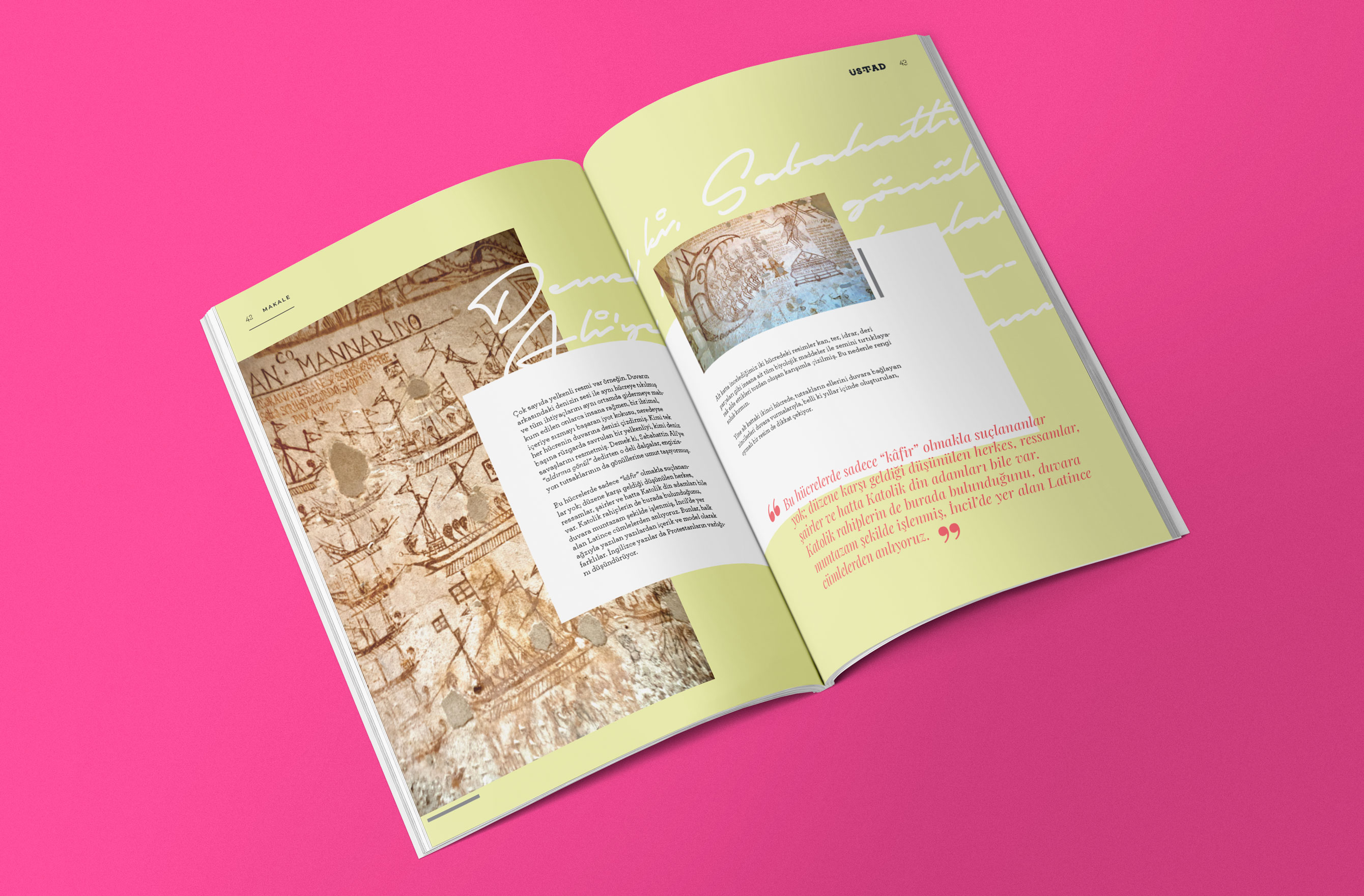
Prison wall drawings, laid up so the handwriting of the piece and the handwriting on the wall belong to the same page.
Fig. 03
Nobody has stock photography of a bar association restricting trainee admissions. So I drew it.
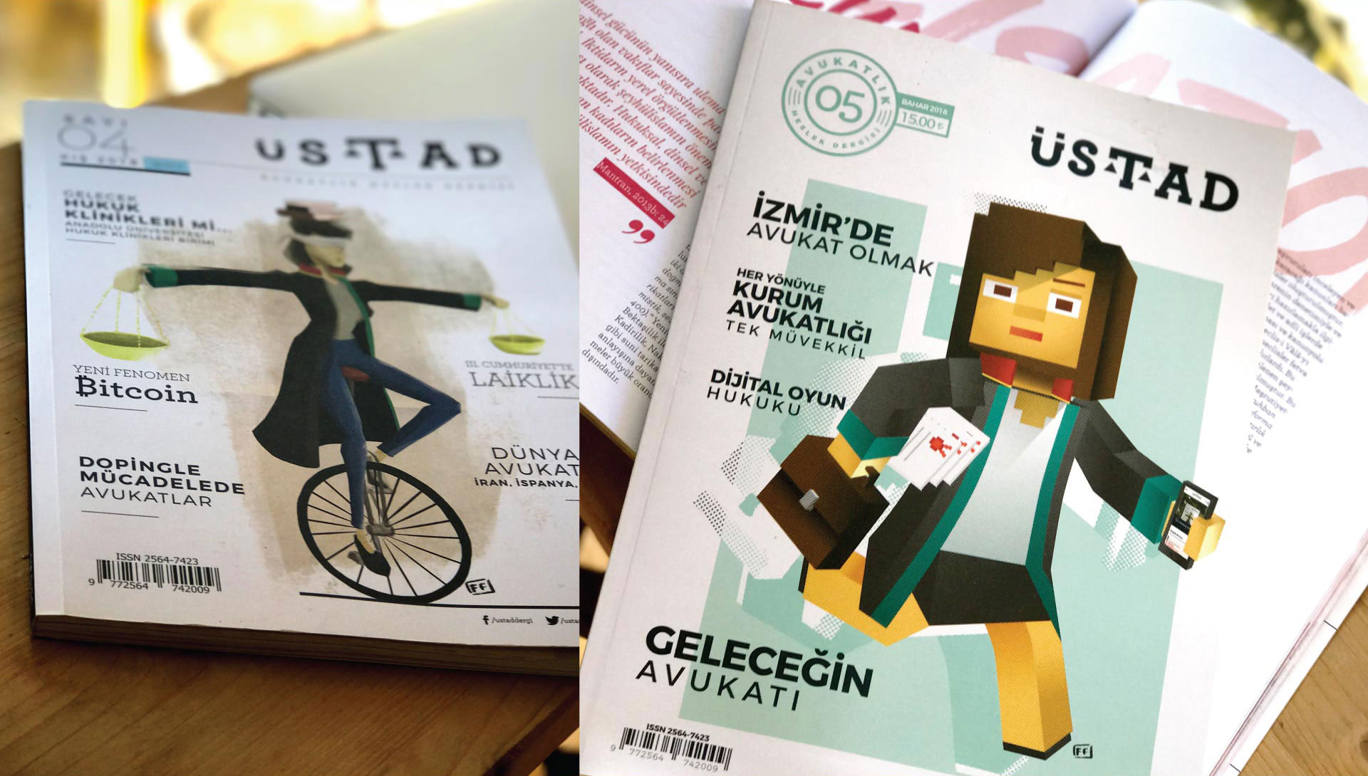
Almost every article needed an image that did not exist, which is how the illustration became the point rather than the decoration. The register changes with the subject: flat vector figures for a piece on bar politics, brush-and-ink portraits for profiles of lawyers, a voxel figure for the future of the profession, torn-paper collage for a piece on secularism, and composited photography when an article needed an object that no longer sits on anyone's shelf.
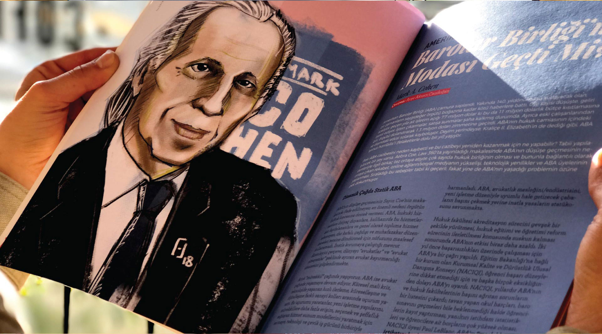
What holds it together is not one style, it is one attitude — every image is an argument about the article, not an ornament on top of it. A portrait of Gandhi in a lawyer's collar makes a claim. A stock photo of a gavel makes none.
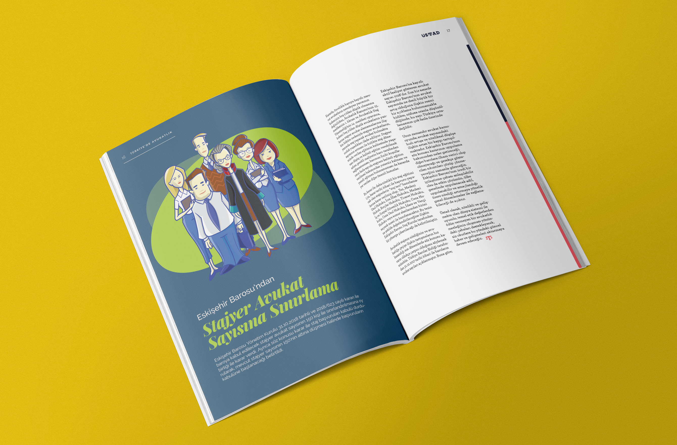
Flat vector work for a piece on trainee admission limits. The illustration is the only warm thing on a page about bureaucracy.
Fig. 04
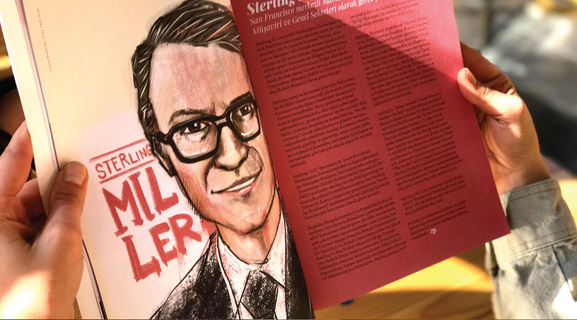
Brush-and-ink portrait for a translated feature on the American Bar Association.
Fig. 05
The same hand, the issue's accent colour flooding the facing page.
Fig. 06
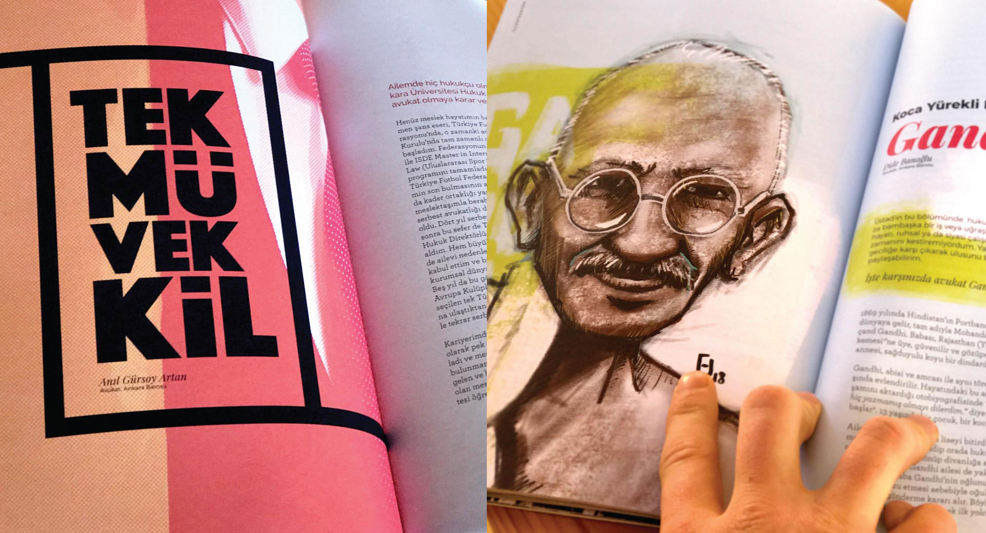
Two registers, one issue: display type carrying a corporate-counsel piece, ink and wash carrying Gandhi.
Fig. 07
A magazine is not a stack of pages, it is a sequence — and eighty pages of good spreads in the wrong order still reads as exhausting.
I laid every issue out as thumbnails first and paced it: a loud full-bleed opener, then a quiet two-column read, then a flooded colour spread, then air. Long features get a visual break every few pages whether the text asks for one or not, because the reader's attention has a shape and it is not the author's outline.
This is the part of the work I use most today. Pacing a long scroll and pacing an eighty-page issue are the same problem: deciding where someone is allowed to rest.
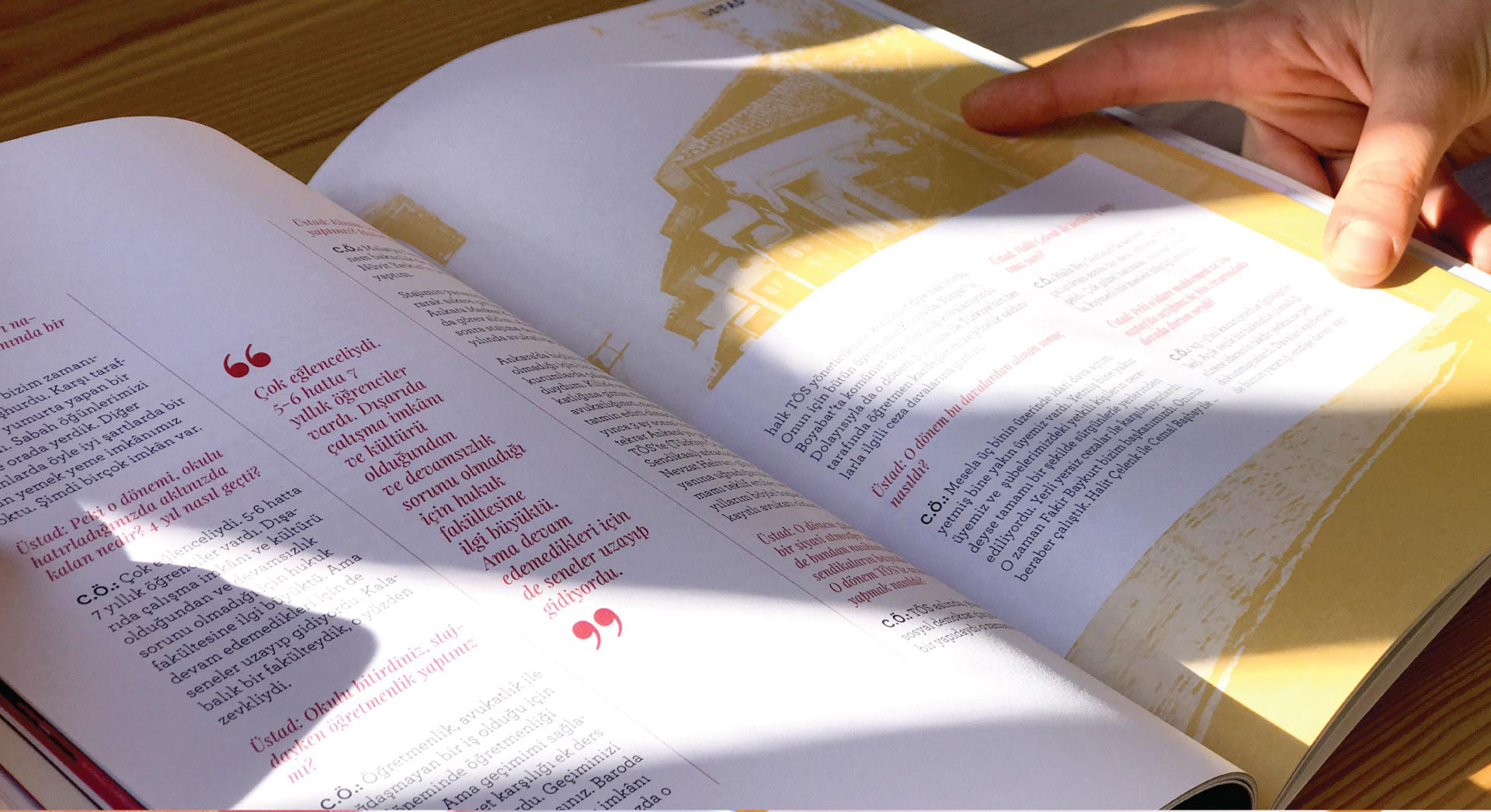
An interview, paced with rotated display quotes so a long transcript still has landmarks.
Fig. 08
Two earlier issues. Each one takes a different illustrative register and the same skeleton.
Fig. 09
Torn-paper collage and duotone for a piece on secularism — printed, and holding up in the hand.
Fig. 10