
Get in touch
Tell me a bit about your project and I'll get back to you by email.
Tell me a bit about your project and I'll get back to you by email.
My first project at Evolving Web — I designed the UI, then built it. Six years later it's still running, and other designers are extending the same system.
Client
Princeton University, School of Public and International Affairs
Studio
Evolving Web — my first project after joining
Role
UI design, then front-end development on the same build — the whole path from layout to shipped template
Since
Back on the dev team for new components with Chin Kiong Ng and Burak Ikiler, to designs by Oksana Herasymenko
A policy school's website is really four websites pretending to be one, and the institution can't tell you which visitor matters most.
A prospective applicant wants programmes, deadlines and cost. A current student wants course logistics. A faculty member wants their own research to be findable. A journalist wants an expert on a subject, today. All four arrive at the same homepage, and a school that publishes constantly — events, research, faculty news — has to keep feeding all of them. Princeton also brings a constraint most clients don't: institutional weight. The design has to feel like a two-hundred-and-fifty-year-old university, not a startup. Restraint is the brief, not a fallback.
I designed a small set of components rather than a set of pages, because a school publishes forever and nobody was going to call me back for page thirty-one.
The vocabulary is deliberately short: a card that holds a person, an article or an event; a section band with an optional feature slot; a listing template with filters. Everything on the site is a recombination of those, which is why an editor can build a new landing page without a designer and it still looks like Princeton. Typography carries the institutional weight — serif display against a clean sans, generous measure, real hierarchy — so the palette can stay almost entirely out of the way and let faculty photography and Princeton orange do the accenting.

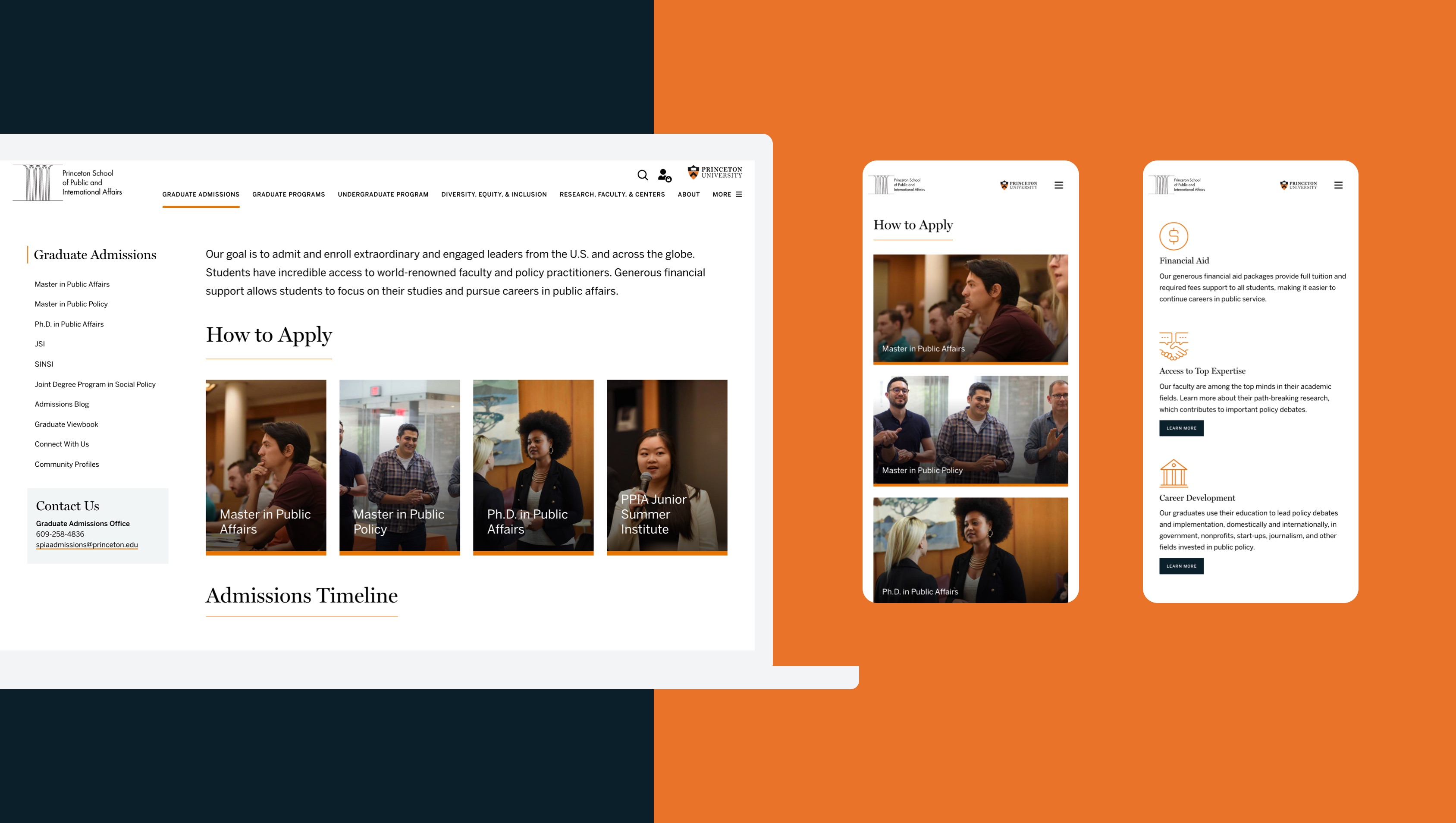
The card: a photograph, a label, an orange base rule. Fields of study here — the same component carries faculty, news and events.
Fig. 01

The section band: half image, half navy panel. Serif display, orange rule, one button — the institutional register in a single component.
Fig. 02
Designing it and then developing it meant every decision I got wrong came back to me personally. That is the most useful feedback loop I have ever had.
In a normal handoff the developer absorbs the awkward parts of a design quietly. Here there was nobody to absorb them. The component that looked fine with three items and broke at eleven, the heading scale that collapsed on a phone, the card that assumed every person has a photograph — I met all of them twice, once as the designer who caused it and once as the developer who had to ship it. It permanently changed how I design. I now draw the empty state and the overflowing state before I draw the happy path, because on this project that is where all the rework was.
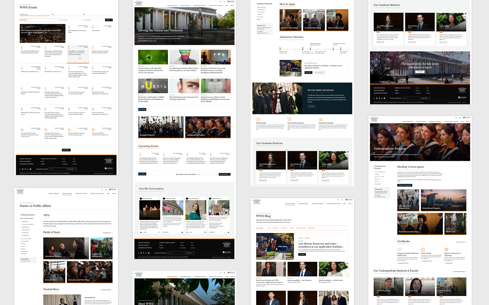
Twelve templates from the original design set. Every one of them is the same handful of components in a different order.
Fig. 03
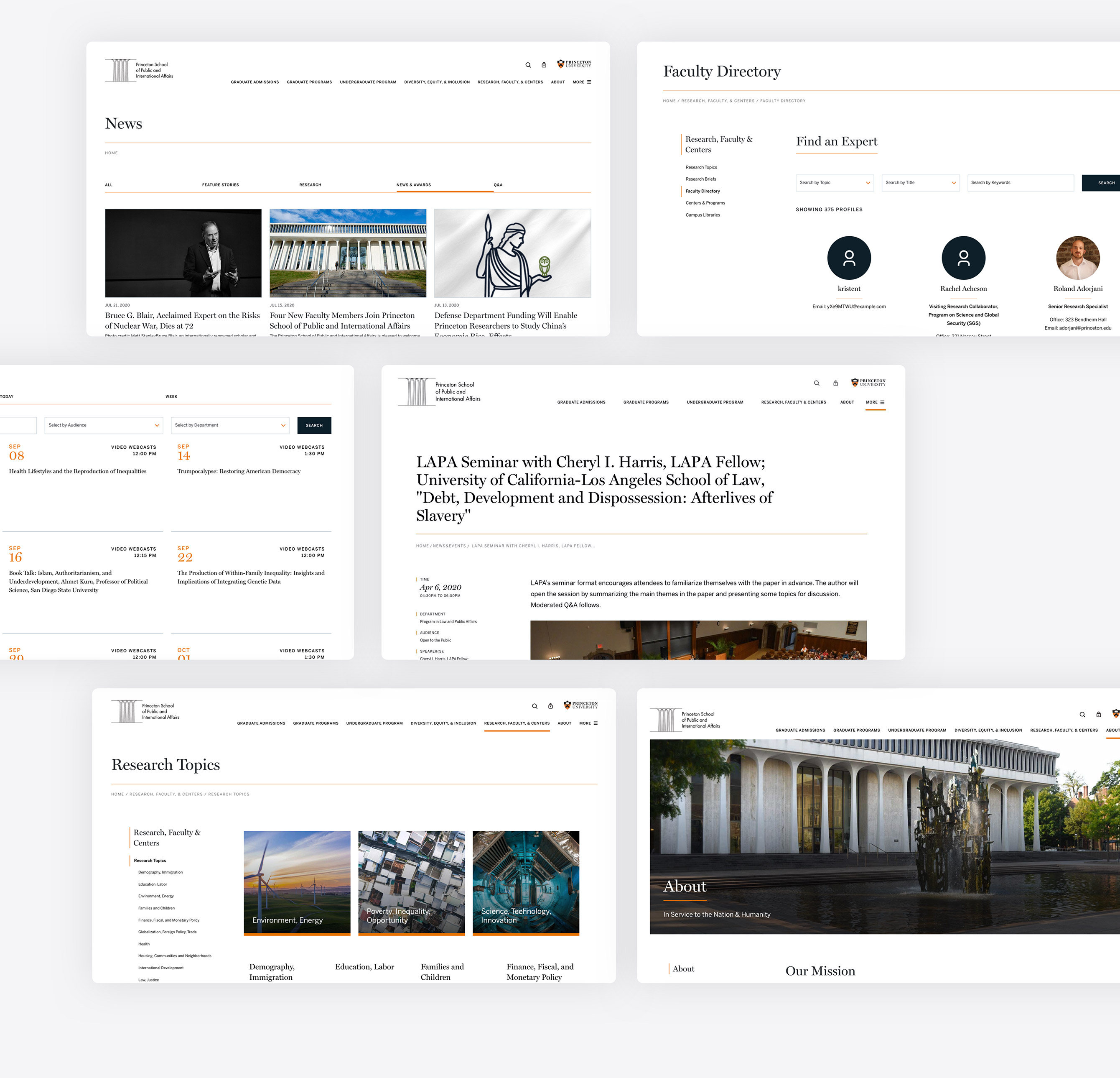
Listings and detail pages — news, a 375-profile faculty directory, events, research topics. All one filtered listing template.
Fig. 04
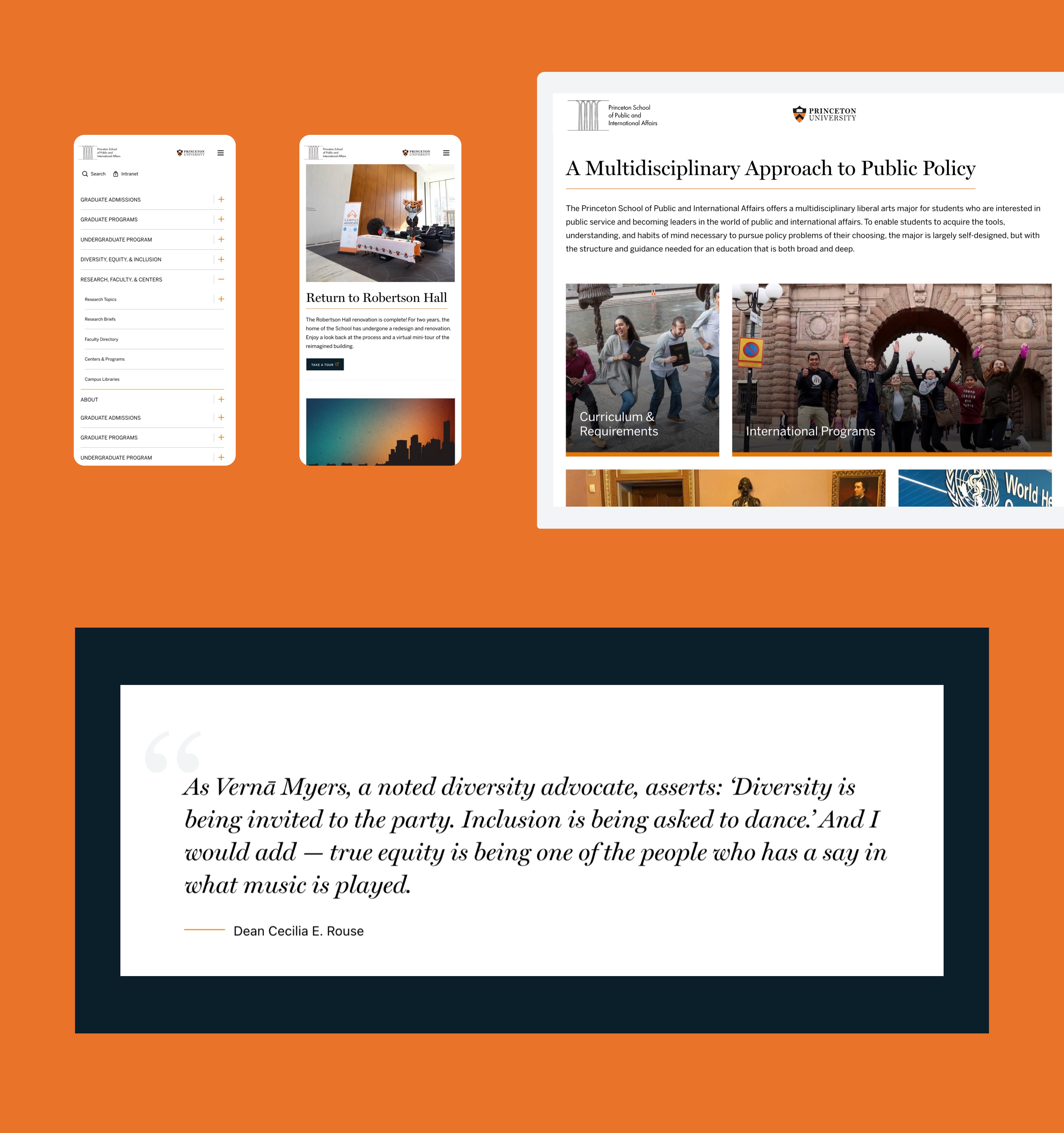
The nested mobile nav — a policy school has six levels of hierarchy and one thumb to navigate it with.
Fig. 05
The homepage has new components on it now, designed by someone else — and they sit inside the original system without a fight. That is the only design-system proof that counts.
Oksana Herasymenko designed the recent additions. I came back to the project as a developer to build several of them, alongside Chin Kiong Ng and Burak Ikiler — this time implementing someone else's design inside a system I'd drawn six years earlier. Being on the receiving end of my own decisions after six years is a rare and slightly uncomfortable privilege. The spacing scale and the card model held up. Some of my early assumptions about image ratios did not, and I got to pay for that myself.