
Get in touch
Tell me a bit about your project and I'll get back to you by email.
Tell me a bit about your project and I'll get back to you by email.
Canada's largest agri-food cooperative. I joined the build late, on a large team, to turn a shape-driven brand into components that hold in two languages.
Client
Sollio Cooperative Group — the largest agri-food cooperative in Canada, rooted in Québec
Studio
Evolving Web — large delivery team, design already underway when I arrived
Role
Front-end developer only — theming and component build, joining mid-project
Scope
A group site spanning three divisions — Sollio Agriculture, BMR, Olymel — in English and French
Visit
https://sollio.coop/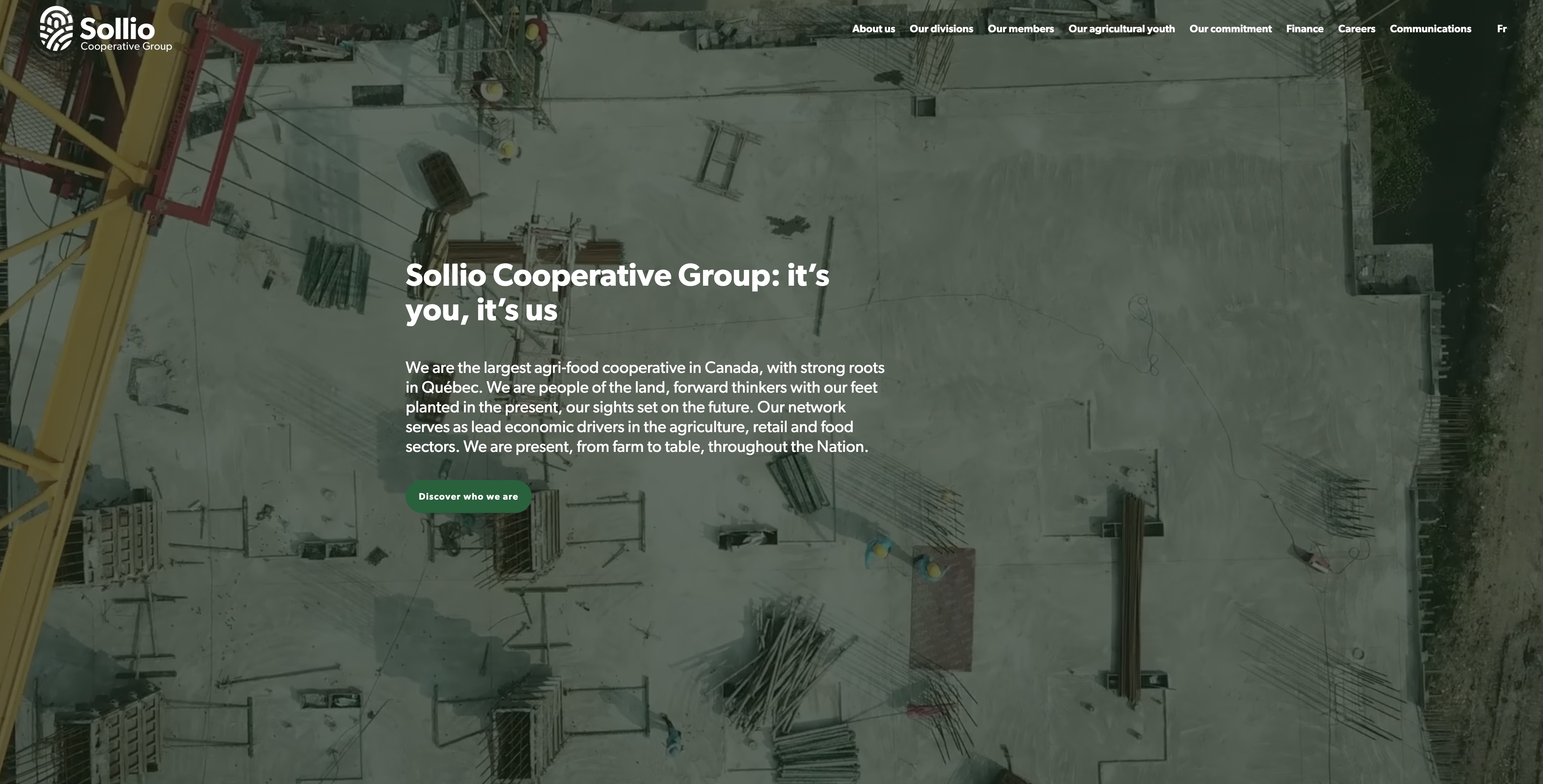
A cooperative has to speak to its own members and to the public at the same time, and those two audiences want opposite things.
Sollio is a group: an agri-business division, a hardware retail network in BMR, and a food producer in Olymel. Members are farmers who want finances, governance and the annual report. The public wants to know what the group actually does. Prospective employees want careers. All of it in French and English, with French as the first language of most of the audience. The design answered that with a strong shape system — circular photo masks, split colour bands, bold sans type on saturated green and blue. My job was to make those shapes behave in a browser.
I came onto this project after the decisions were made. That is the normal condition of front-end work, and it has its own craft.
Arriving mid-build means the architecture, the naming and the patterns are already set, and half of them are set for reasons nobody has written down. The useful skill is reading an existing codebase well enough to add to it invisibly — matching conventions you disagree with, rather than leaving your own signature across a file someone else maintains. On a large team the measure of a good contribution is that nobody can tell which components were yours. On this project I think that's true, and I mean it as the compliment.
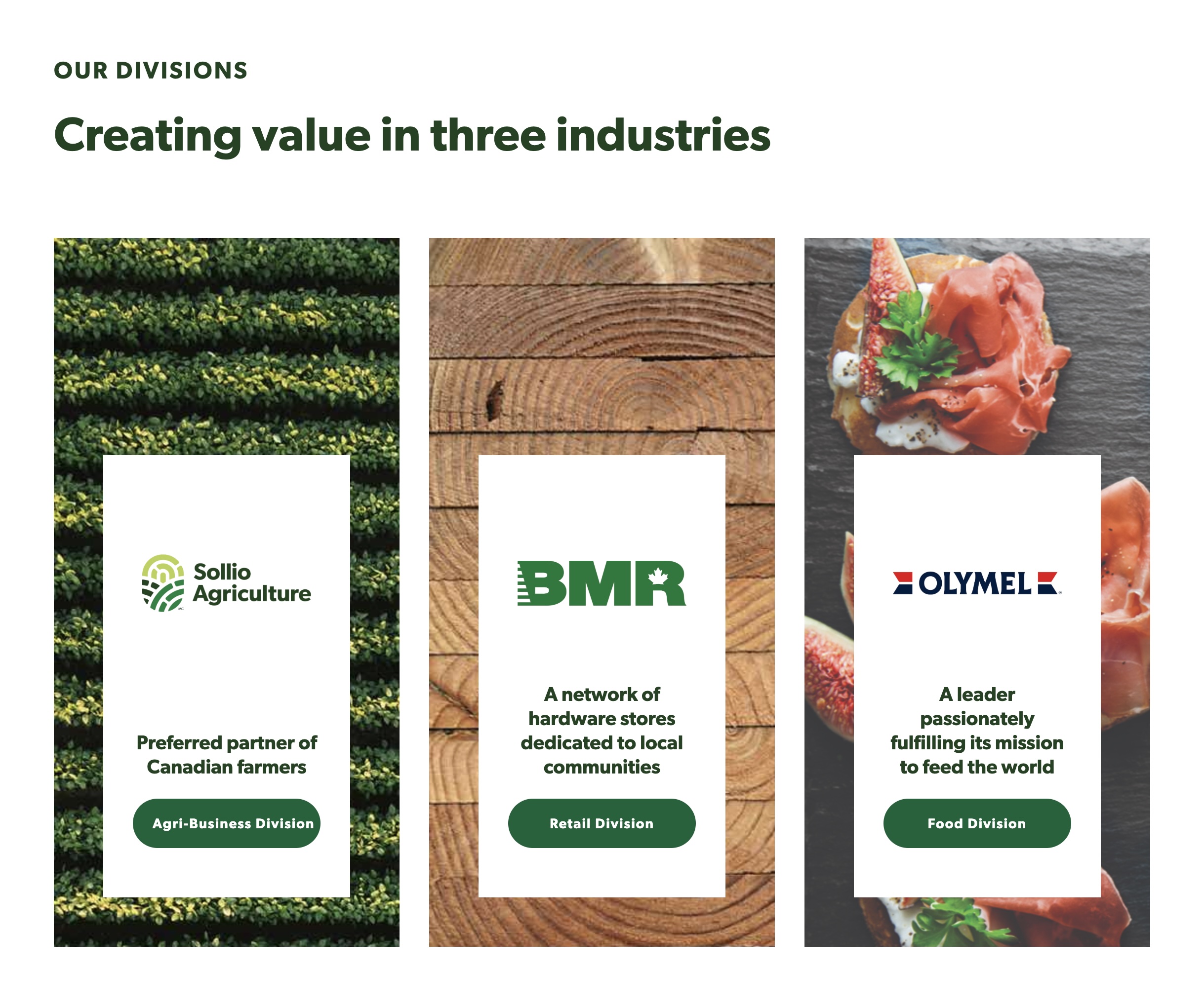
Three divisions, one card. A white panel floating on a photograph, holding a third-party logo whose colours I don't control — so the panel does the contrast work.
Fig. 01
Circles and split bands are easy in a static layout and unforgiving in a fluid one, because a circle has to stay a circle at every width.
The brand's signature is a photograph masked into a circle that bleeds off one edge, sitting against a hard colour split. Built naively that gives you an ellipse at some widths, a mask that clips the subject's head at others, and a colour split that lands mid-word. So the circles are aspect-locked and positioned from the edge they bleed off rather than from the container, the concentric rings are drawn rather than image-based so they stay crisp at any size, and the split bands stack into full-width blocks below the breakpoint instead of trying to keep a side-by-side that no longer has room.
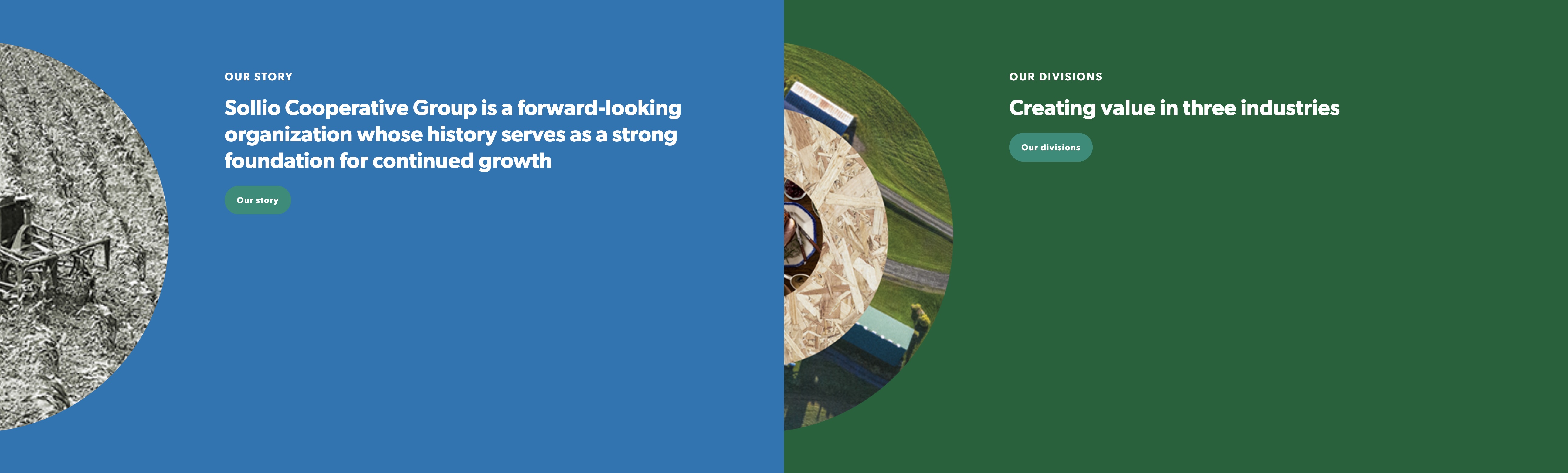
The split band. Two half-width panels, each with a circle bleeding off the left edge — the component that breaks first when the viewport narrows.
Fig. 02
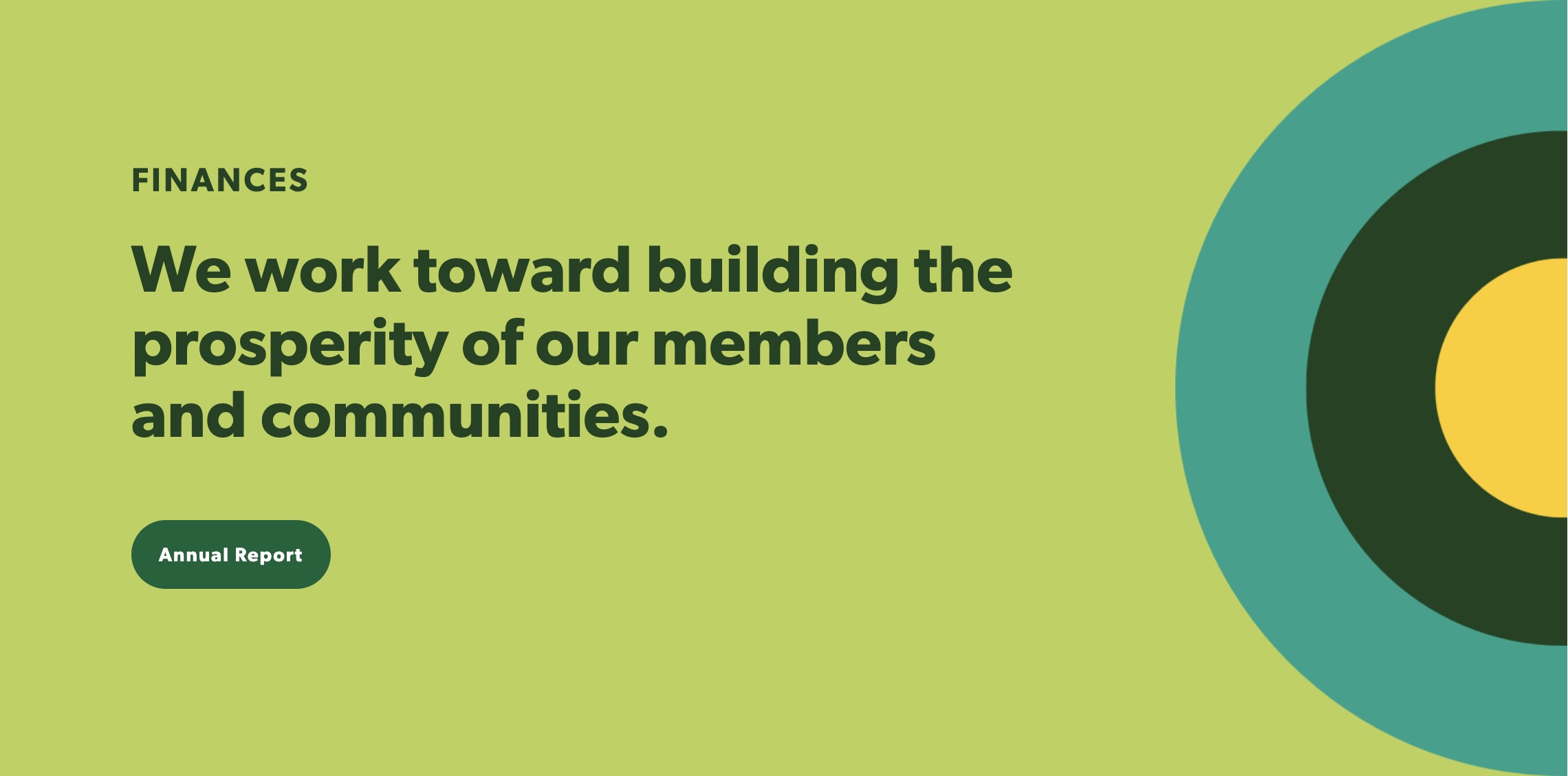
Concentric rings, drawn rather than placed — they scale to any band height without going soft or reflowing the text.
Fig. 03
Every hero on this site is white type on a photograph an editor chooses later, in a language that runs longer than the one it was designed in.
That is two contrast problems at once. The photograph might be a dark barn or a bright field, so the treatment can't depend on the image — the green wash and gradient behind the copy are part of the component, not part of the picture. And the French headline is reliably longer, so the type has to be able to grow by a line without pushing the button out of the band. I built and reviewed these in French first for exactly that reason. If it fits and reads in the longer language, English is free.
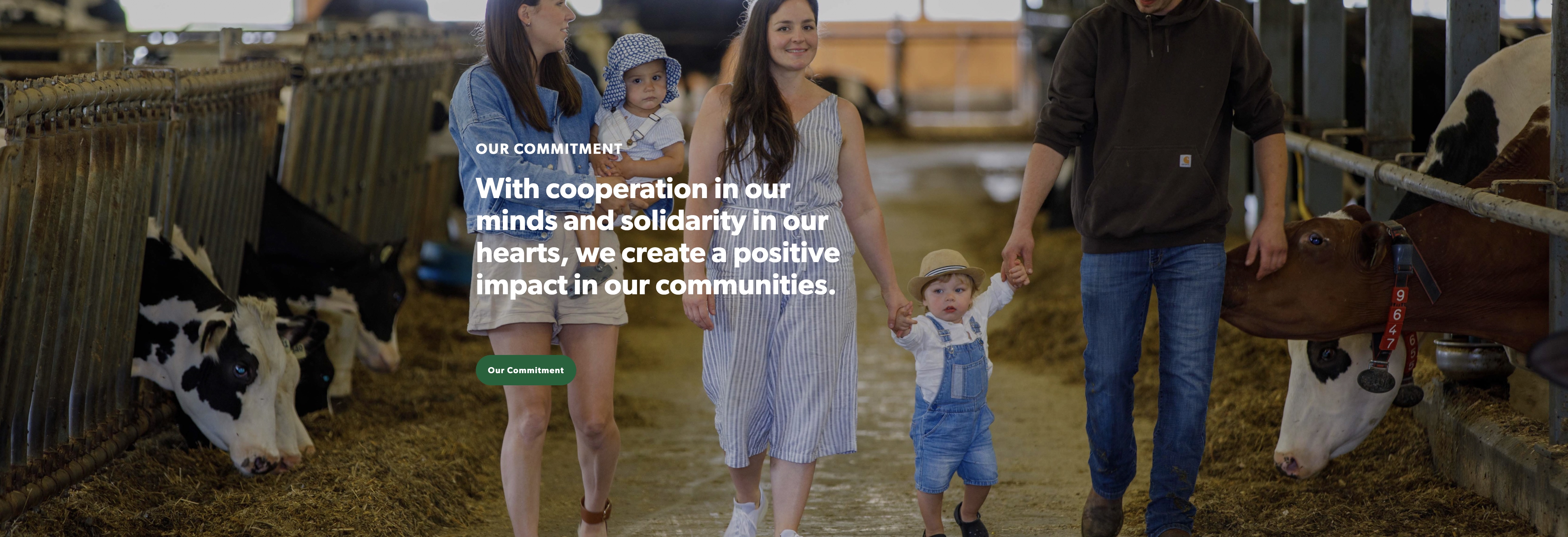
The copy sits over the one part of the frame the component can guarantee is dark. Nothing here depends on which photograph the editor picks.
Fig. 04