
Get in touch
Tell me a bit about your project and I'll get back to you by email.
Tell me a bit about your project and I'll get back to you by email.
Canada's largest museum, rebuilt on Drupal — and my job was making an art-directed brand behave like a website that anyone can use.
Client
Royal Ontario Museum, Toronto — 18 million objects, 40 galleries, over a million visitors a year
Studio
Evolving Web, with LG2 translating the ROM brand to digital
Role
Front-end developer on a four-person delivery team — theming, interaction components, bilingual and accessibility work
Team
Olha Davydovych, project manager · Don Lalicon, tech lead · Oleh Shevchuk, back-end and front-end
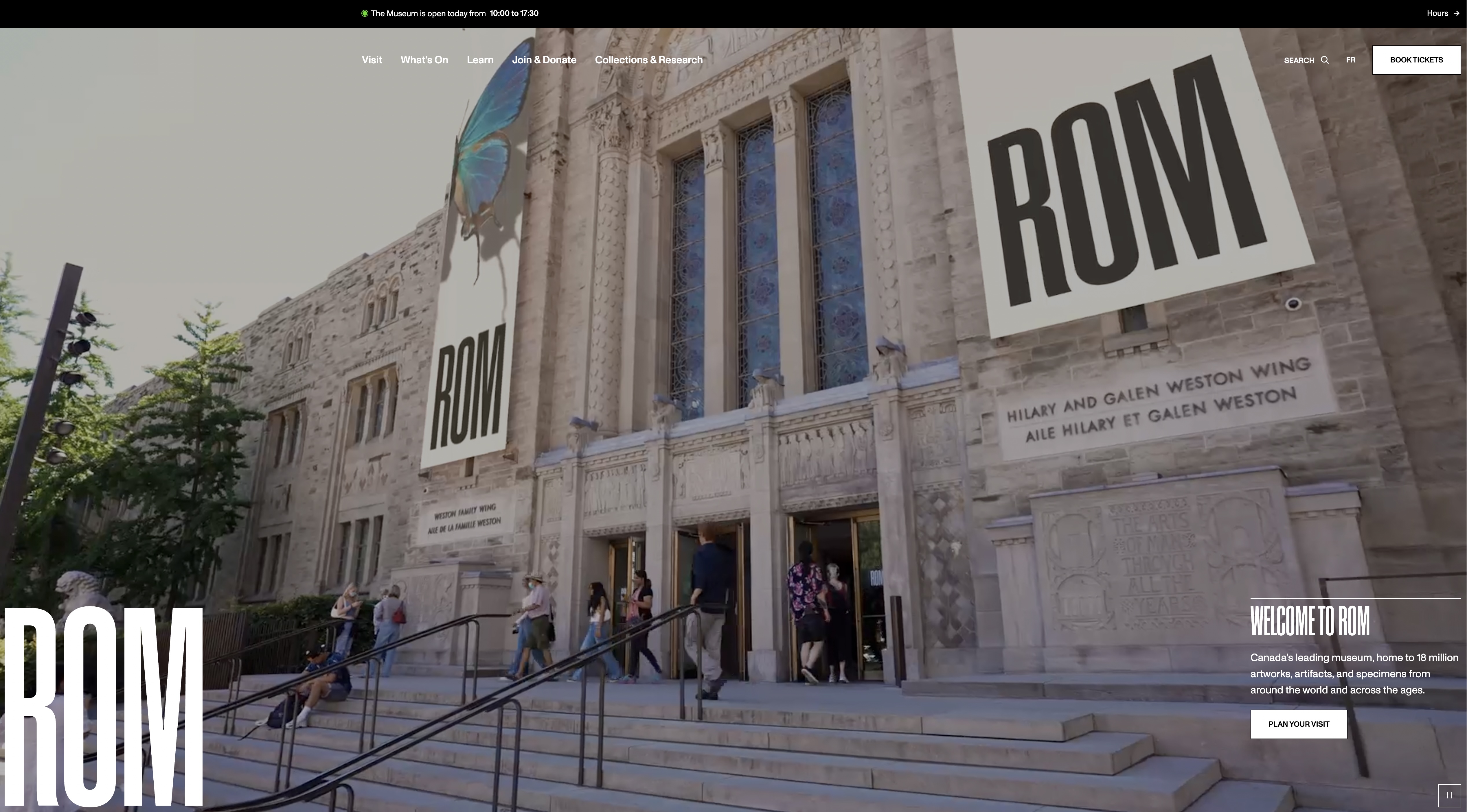
A museum site has to sell a ticket and hold a research collection, and the same page is often being read by a family and an academic.
The ROM came off Drupal 7 with sixty content types, most of them barely used, and a visual identity that had moved on without the website. Four audiences pull in different directions: occasional visitors who need hours and tickets, members, educators, and researchers who need the collection.
My end of that was the front end — turning an art-directed design into templates that stay legible when the content is a photograph, a school programme, or a bilingual object record.
The ROM identity is enormous condensed type over full-bleed imagery. Beautiful in a layout, hostile in a browser.
Type that size has to survive a French translation thirty per cent longer than the English, a 320px phone, and a 200% zoom. Text over photography has to keep its contrast when an editor swaps in a bright gallery shot. Full-bleed video has to not cost a visitor their data plan, and has to have a pause control that a keyboard can reach.
So most of my work here was writing the rules the design implied but didn't state: clamp scales instead of fixed sizes, a scrim behind every overlaid panel, and one shared behaviour for every piece of media on the site.
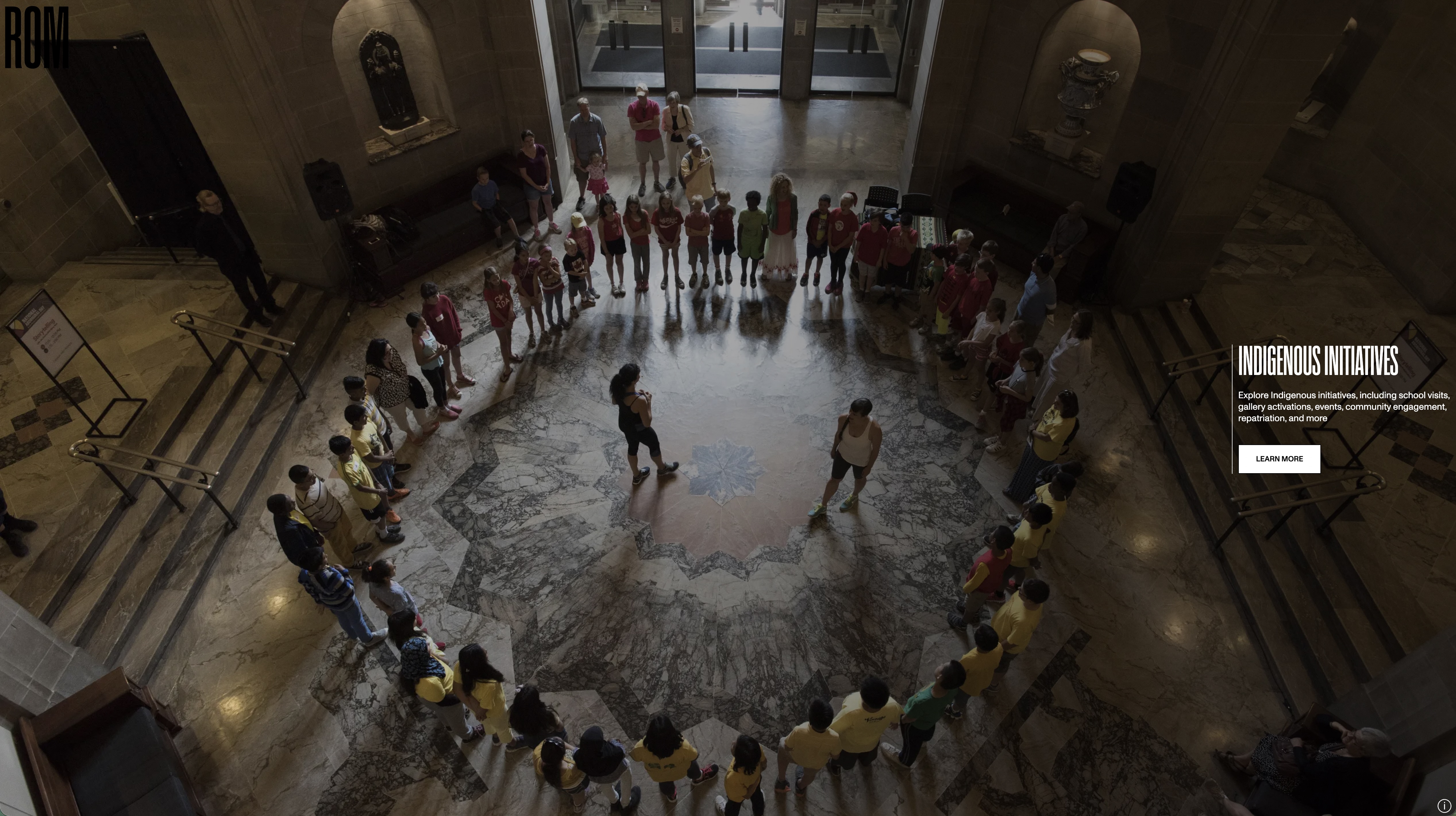
Overlaid panels sit on a scrim and a rule, so the copy holds its contrast whatever photograph an editor chooses.
Fig. 01
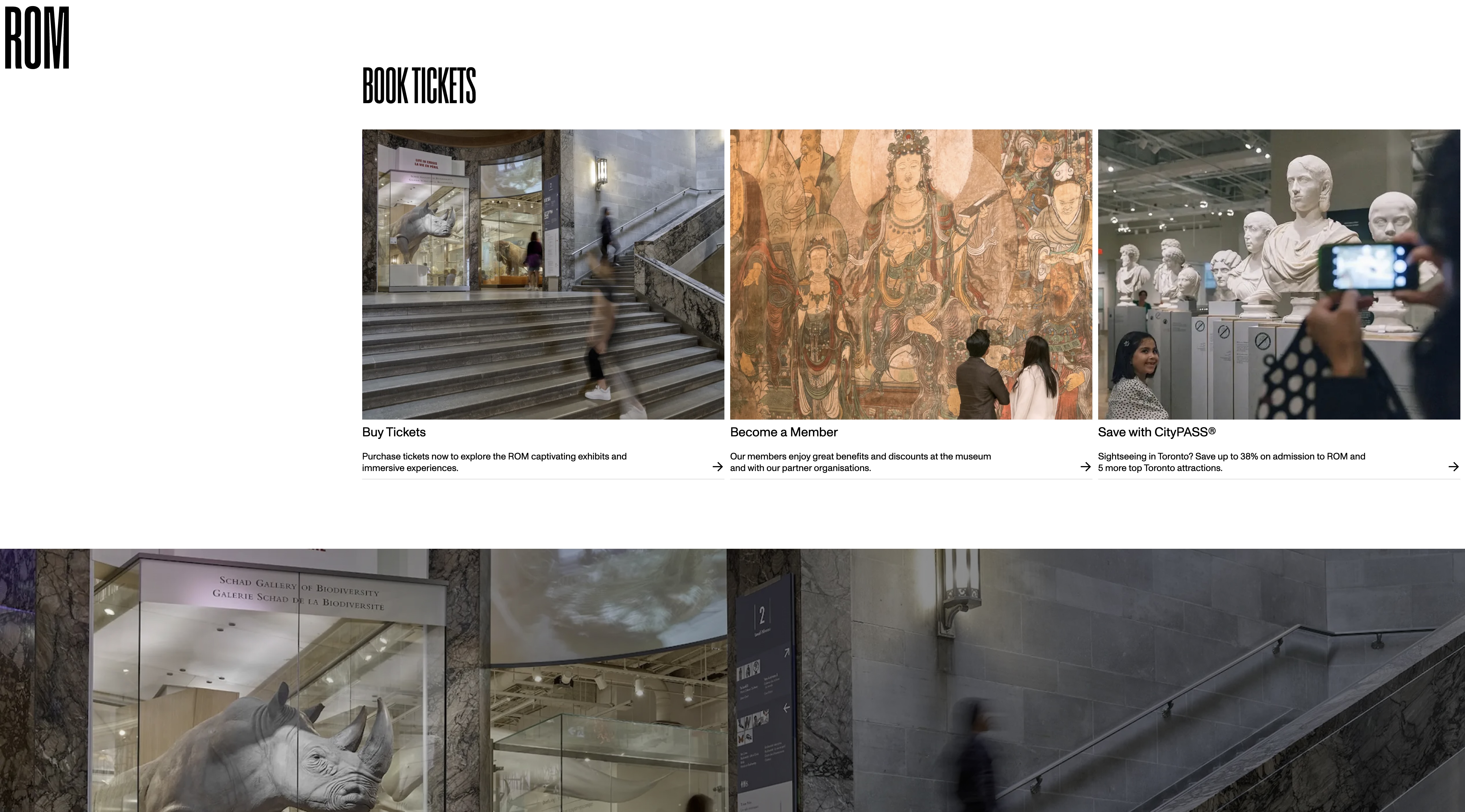
The revenue path — tickets, membership, CityPASS — as one card component with three states, not three bespoke sections.
Fig. 02
Forty galleries across five floors, presented as a list you move through while the photograph behind it changes.
This was the most interesting component I built. Hovering a gallery name swaps the background image; the floor number sits in the corner and changes with it. It reads like a museum wayfinding board, which is exactly right for the content.
It is also the component where a pretty interaction most easily becomes unusable. Hover alone excludes anyone on a keyboard or a touchscreen, so focus drives the same state change as hover, the list is a real navigable list rather than a set of divs, the images preload on intent instead of all at once, and the whole thing collapses to a plain linked list on a phone where there is no room for a backdrop.
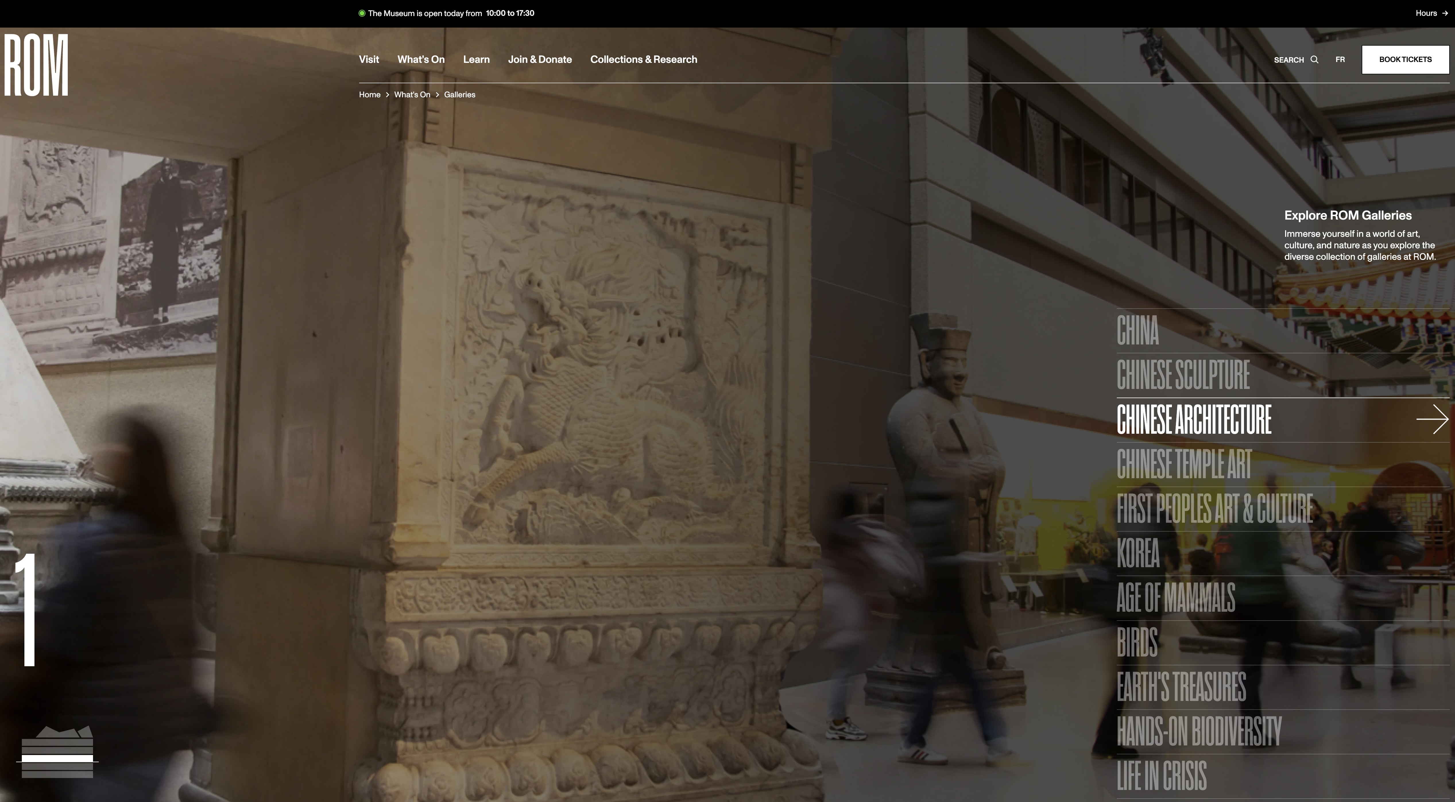
The active name is the only element at full opacity — the rest of the list stays legible but recedes.
Fig. 03
A bilingual site is not a translated site. Every component has to be designed for whichever language runs longer.
French runs longer than English almost everywhere, and it lands hardest on the elements with the least room — nav items, buttons, the condensed display type. I built and reviewed every template in both languages rather than in English and then in translation, which is the difference between catching a broken button in development and catching it after launch.
The accessibility work sat in the same pass: keyboard order through overlaid panels and the navigator, visible focus that survives being placed over a photograph, real landmarks and heading structure, and media controls that don't rely on a pointer.