Get in touch
Tell me a bit about your project and I'll get back to you by email.
Tell me a bit about your project and I'll get back to you by email.
A business school where the whole site is white space, photography and restraint. I built the front end — and tested its accessibility with more than one tool, on purpose.
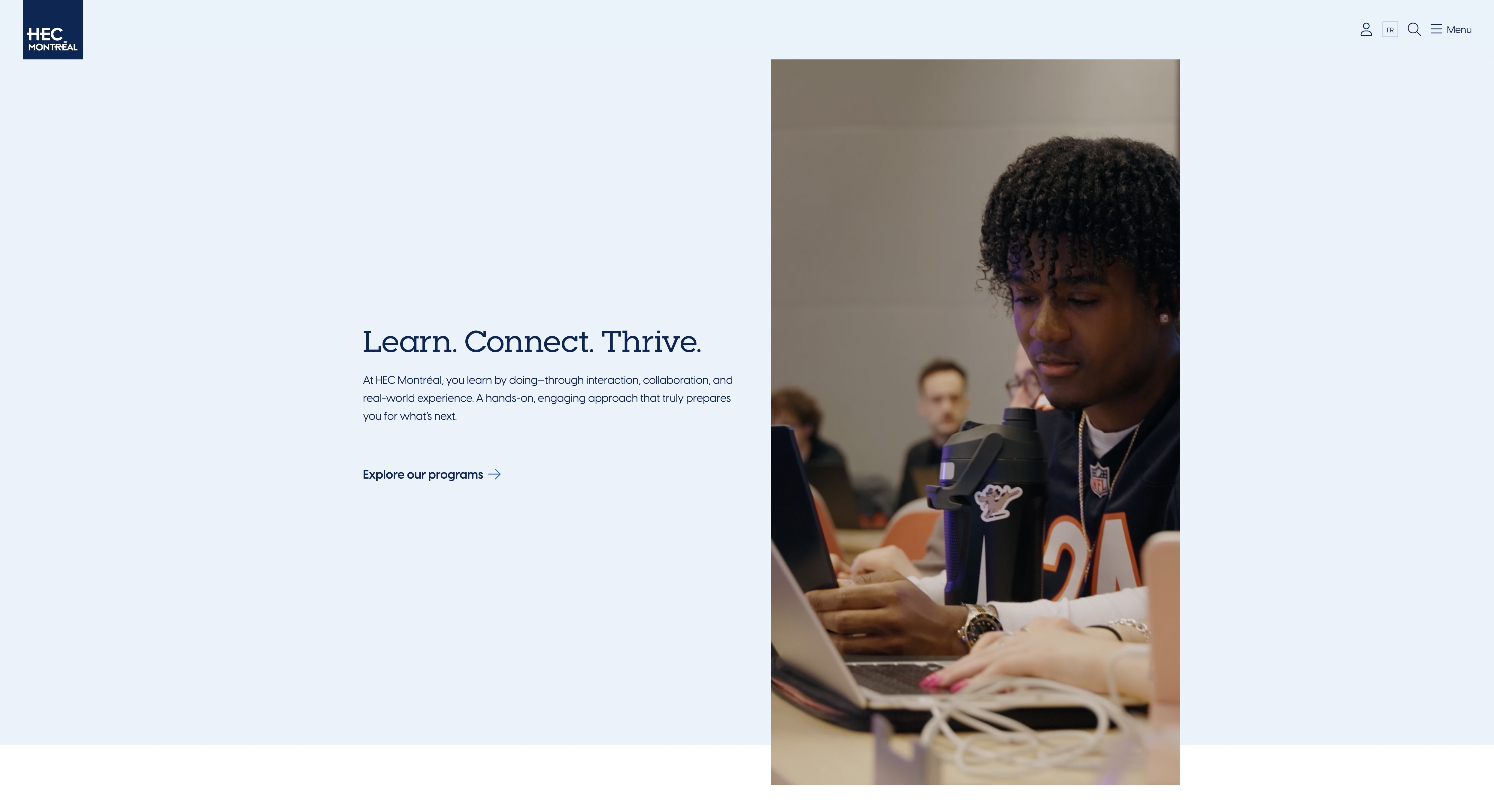
A university site has more audiences than a product ever does — and this one had to look effortless while serving all of them.
Prospective undergraduates, working professionals looking at certificates, executives, researchers, current students, alumni. Four program families, each with its own funnel, all reachable from one homepage without that homepage turning into a directory. The design answered that with air: large photography, one idea per band, navy type on pale blue, almost no chrome. Designs like this are unforgiving to build. There is nothing to hide a spacing mistake behind, and every alignment is visible at every breakpoint.
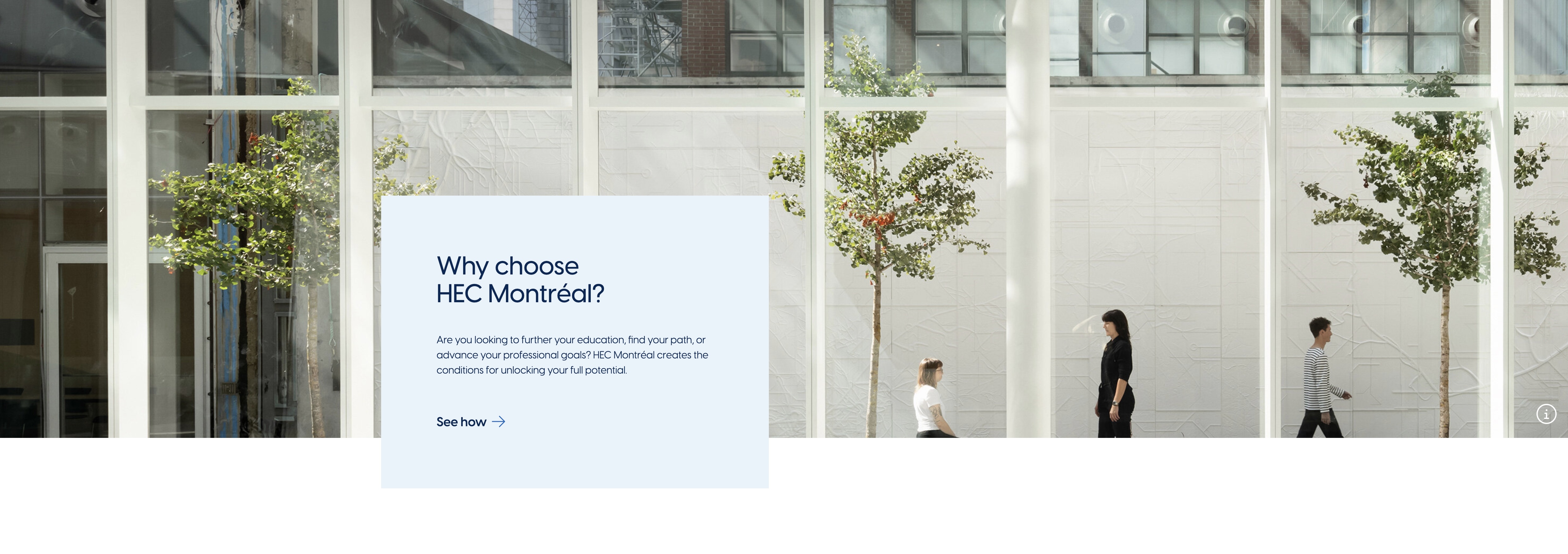
The hard components here were the quiet ones: overlapping cards, edge-bleeding carousels, and tabs that swap a whole grid.
The overlap card needed a layout that couldn't collapse into overlapping text when a French string ran longer than its English twin. The photo carousel bleeds off both edges with arrows floating over the images — so it needed a real scroll container, focus-visible arrows, and images that don't shift the page as they load. The programs section swaps three cards and a link when you change program family. That is the component where most sites quietly lose keyboard users: the tab looks like a link, behaves like neither, and the newly revealed content is announced to nobody. It got a proper tab pattern instead.

I ran several accessibility tools on this site, and I'd do it again. Any single tool teaches you its own blind spots.
Axe in the browser for component-level work while a menu or a panel is actually open. A custom runner built on the Axe API for repeatable sweeps across templates, so a regression showed up as a diff rather than as someone remembering to check. Then a second automated tool over the same pages — not for a bigger list, but to see where the two disagreed. The disagreements are the useful part. Two tools reporting the same violation is a fix. One tool reporting something the other doesn't is a question — usually about a component that's ambiguous enough to be worth rebuilding rather than patching.

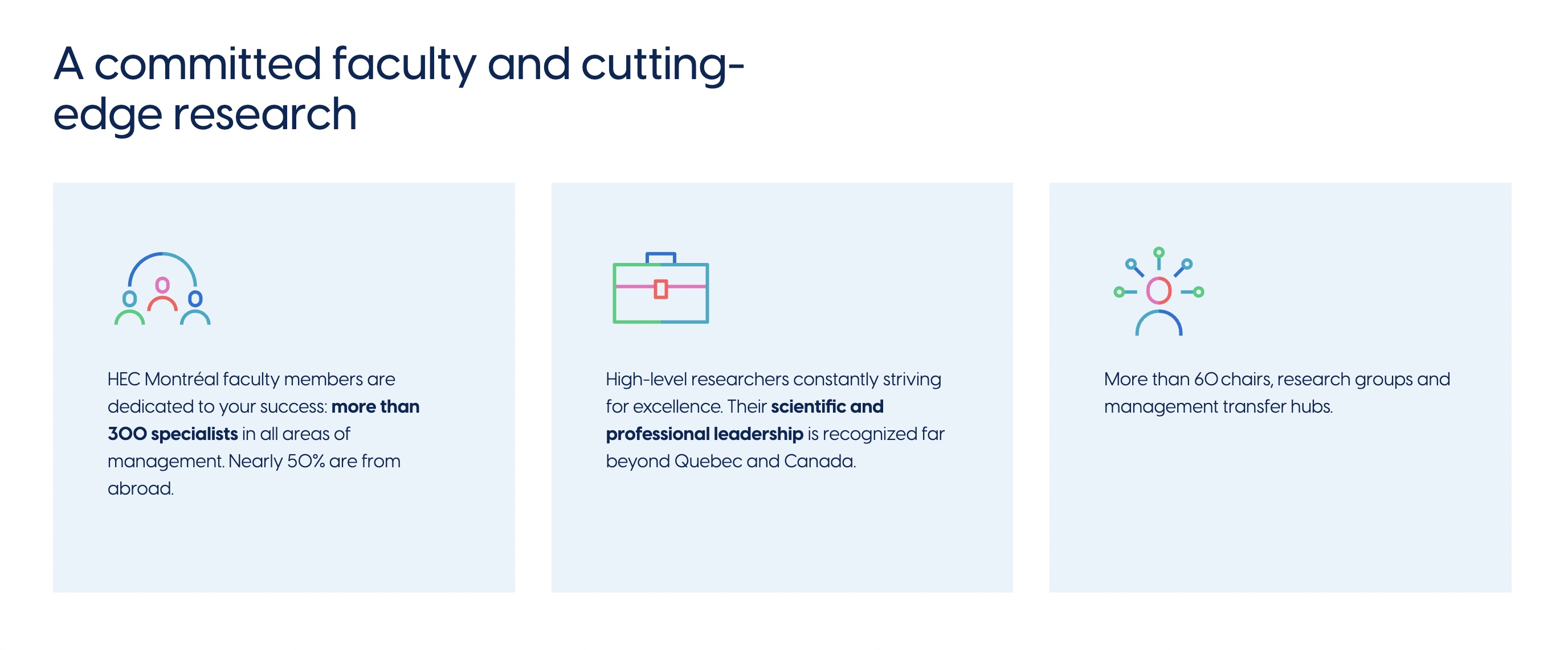
Sebastian Lemieux and Andriy Tkachuk held the back end. I held the front. The seam between us is where the markup gets decided.
On a split like this, accessibility is a shared surface whether anyone says so or not. Heading levels come out of how content types are structured. Link text comes out of field configuration. Image alternatives come out of what editors are asked for and whether the field is required. So the useful habit was bringing findings back as structural requests rather than CSS patches — a field that should be required, a template that should emit a different element, a label that needs to exist in both languages. Cheaper for them to change once than for me to work around forever.