
Get in touch
Tell me a bit about your project and I'll get back to you by email.
Tell me a bit about your project and I'll get back to you by email.
The CN Tower, the Old Port, the Science Centre — one federal Crown corporation site, built fast, on an AI-assisted pipeline from prototype tokens to Drupal SDCs.
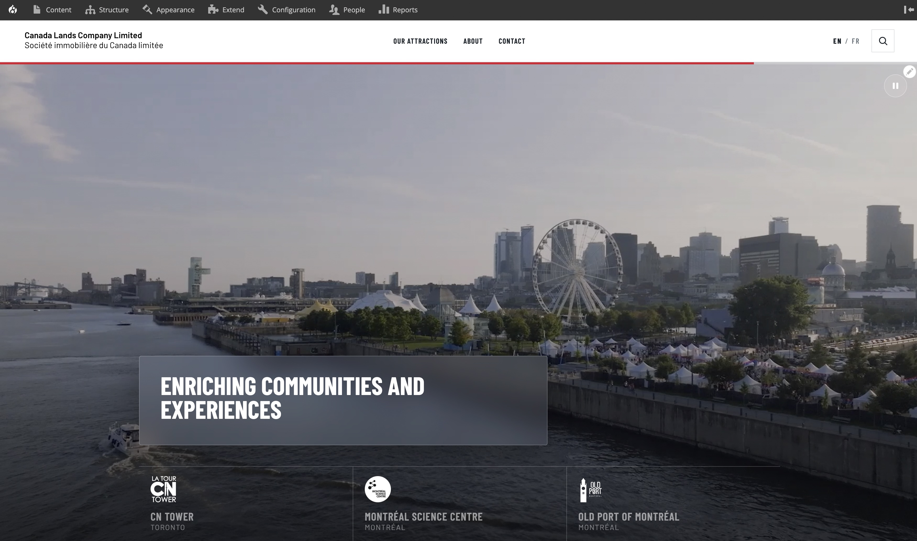
A Crown corporation nobody has heard of, which owns three landmarks everybody has. The site has to introduce the parent without upstaging the children.
Canada Lands Company is accountable to Parliament and to the public: annual reports, governance, senior management, procurement. It also owns the CN Tower, the Old Port of Montréal and the Montréal Science Centre, each with its own strong brand and its own website. So the corporate site does two jobs. It sends visitors to the attractions quickly and respectfully, in each attraction's own colours. And it serves the accountability audience — journalists, government, prospective partners — who need documents, not photography. All of it in both official languages, on a timeline that left no room for a second attempt.
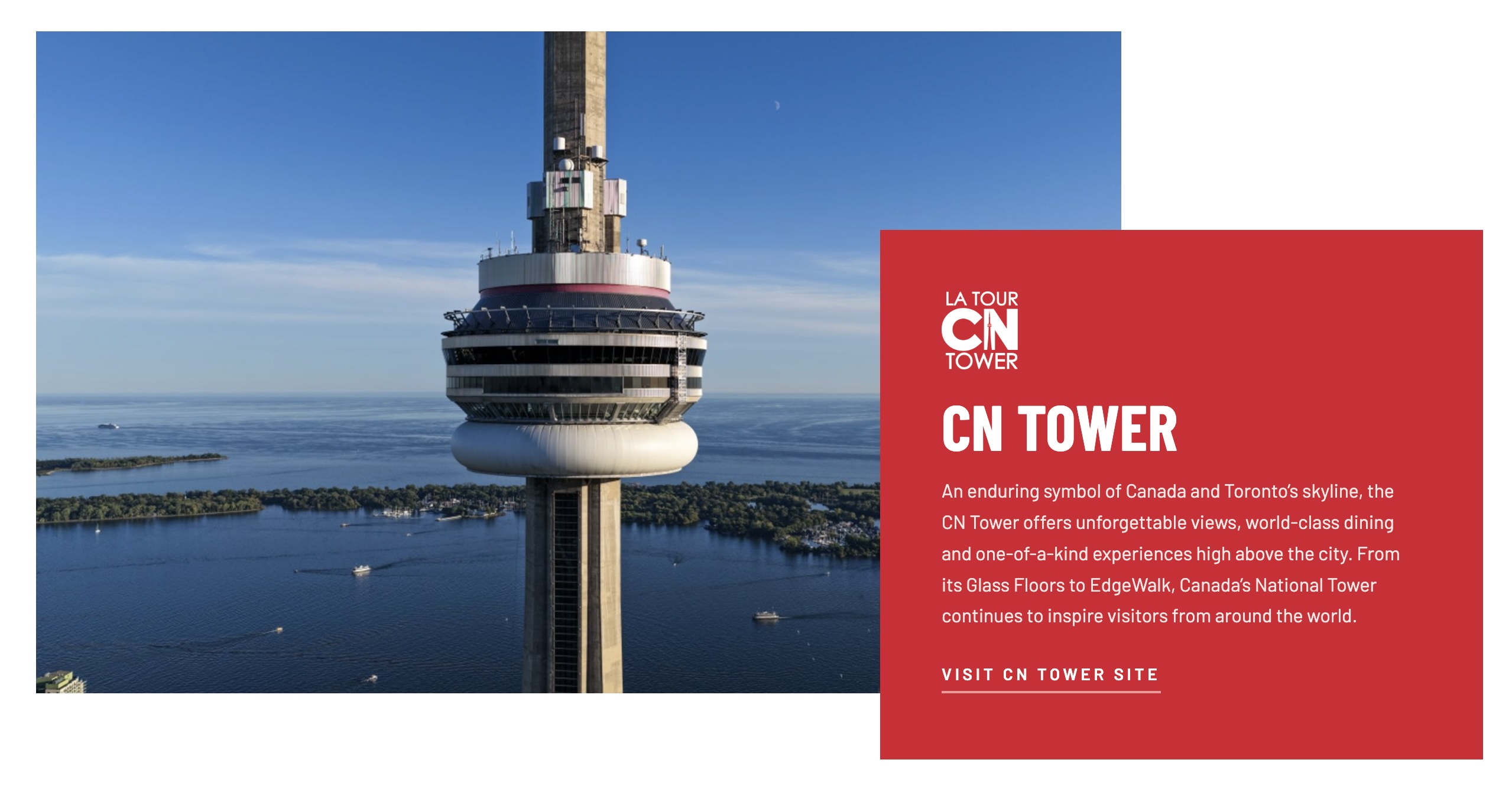
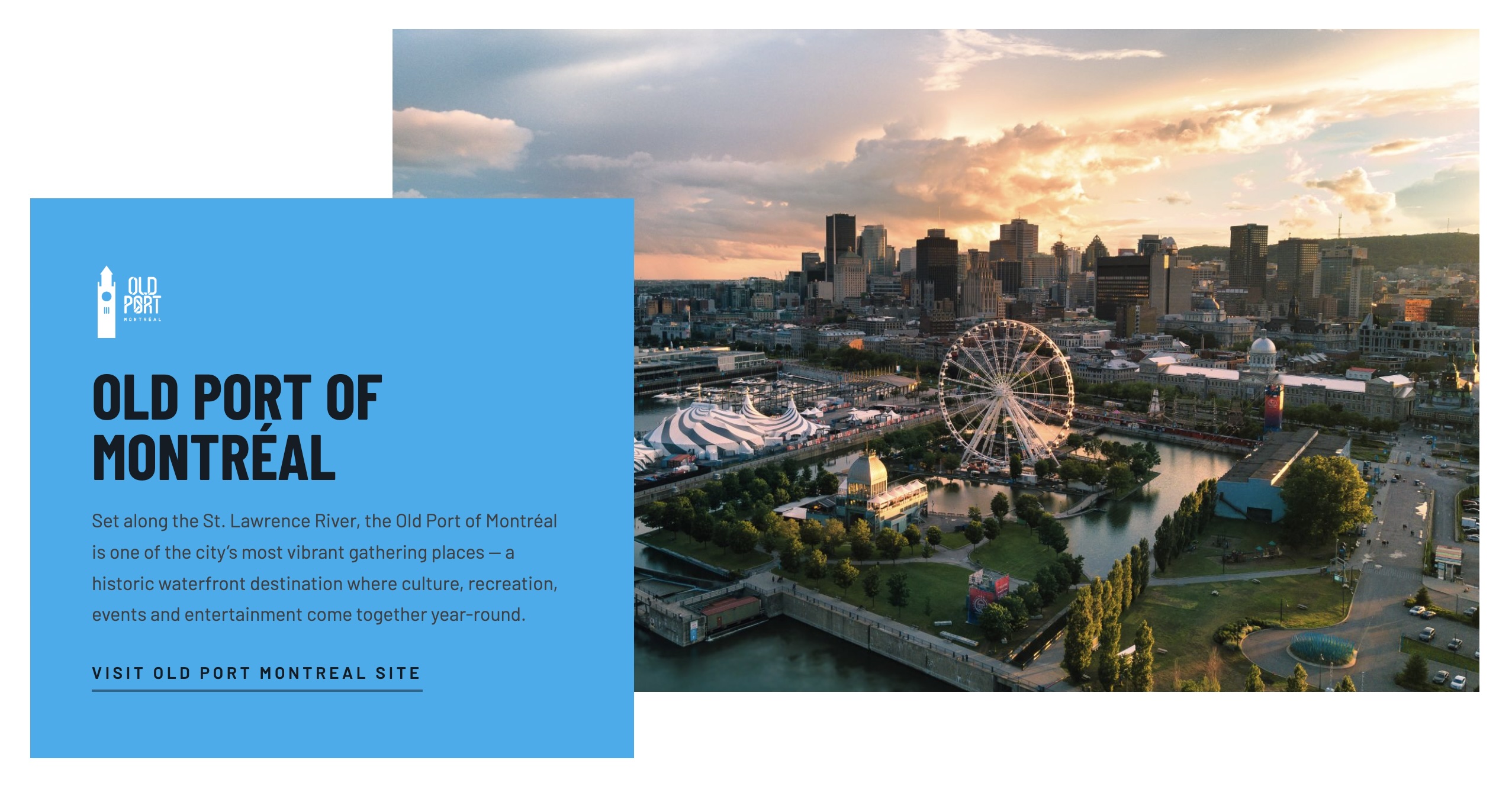

Anton's prototype already had real design tokens in it. That single fact is why this timeline was survivable.
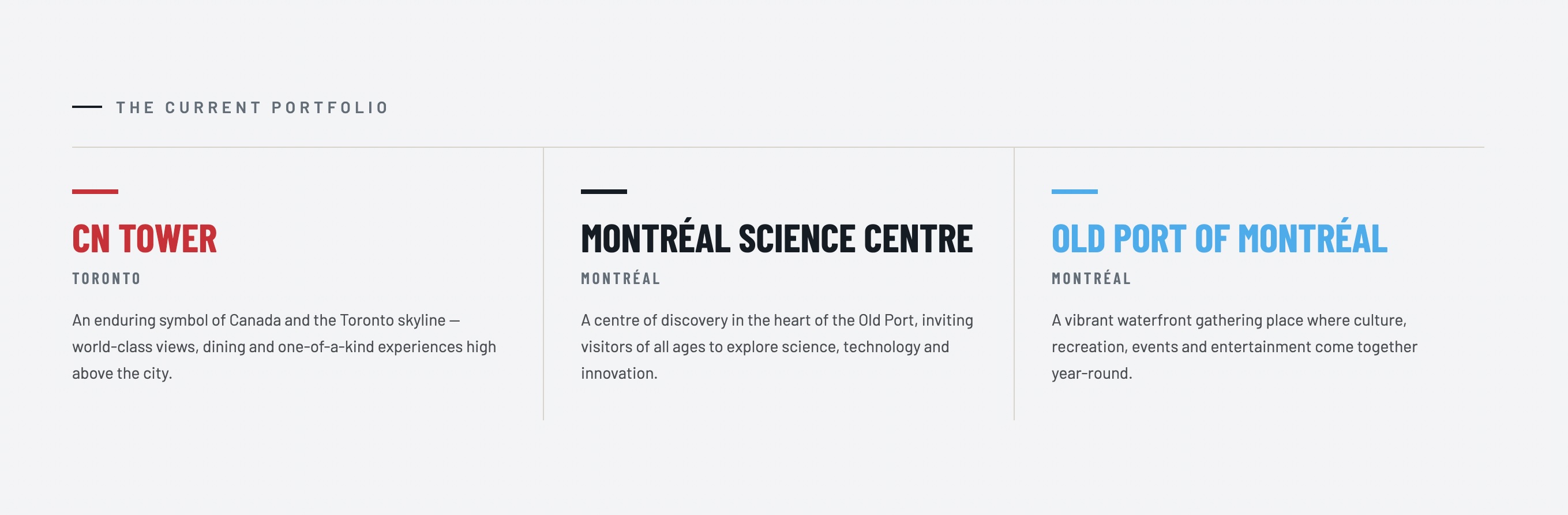
The usual handoff loses a week to translation: a developer reads a design, invents names for its values, and every disagreement about a shade or a spacing step becomes a conversation. Here the design arrived with its scale already declared — colours, type steps, spacing — so I carried the tokens into the theme rather than re-deriving them. The knock-on effect matters more than the time saved. Because the attraction colours are tokens, the CN Tower crimson, Old Port cyan and Science Centre navy are one component with a variable, not three components that happen to look alike.
I built the front end as Single Directory Components exposed as blocks, so the client can compose pages in Layout Builder without a developer in the loop.
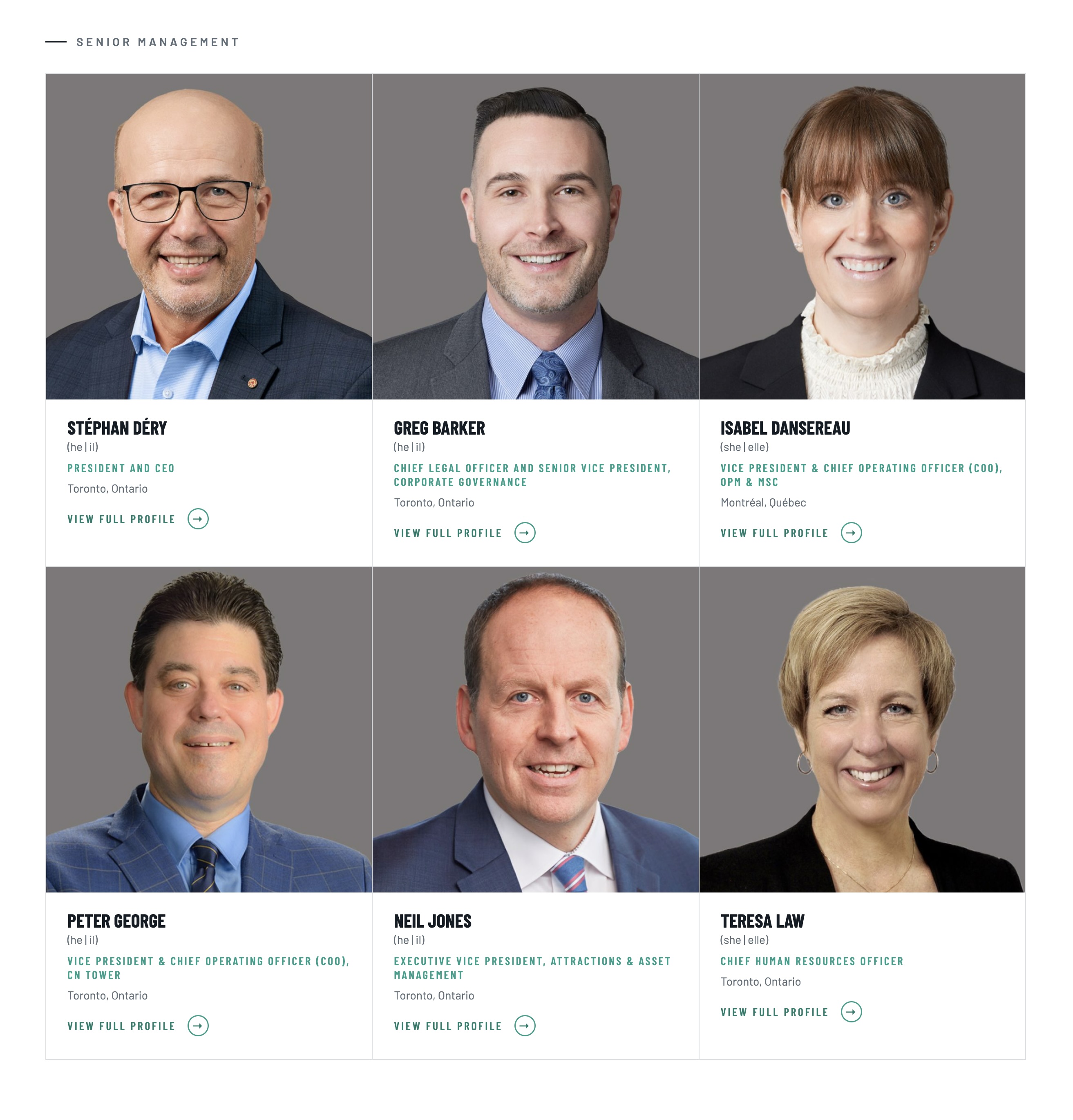
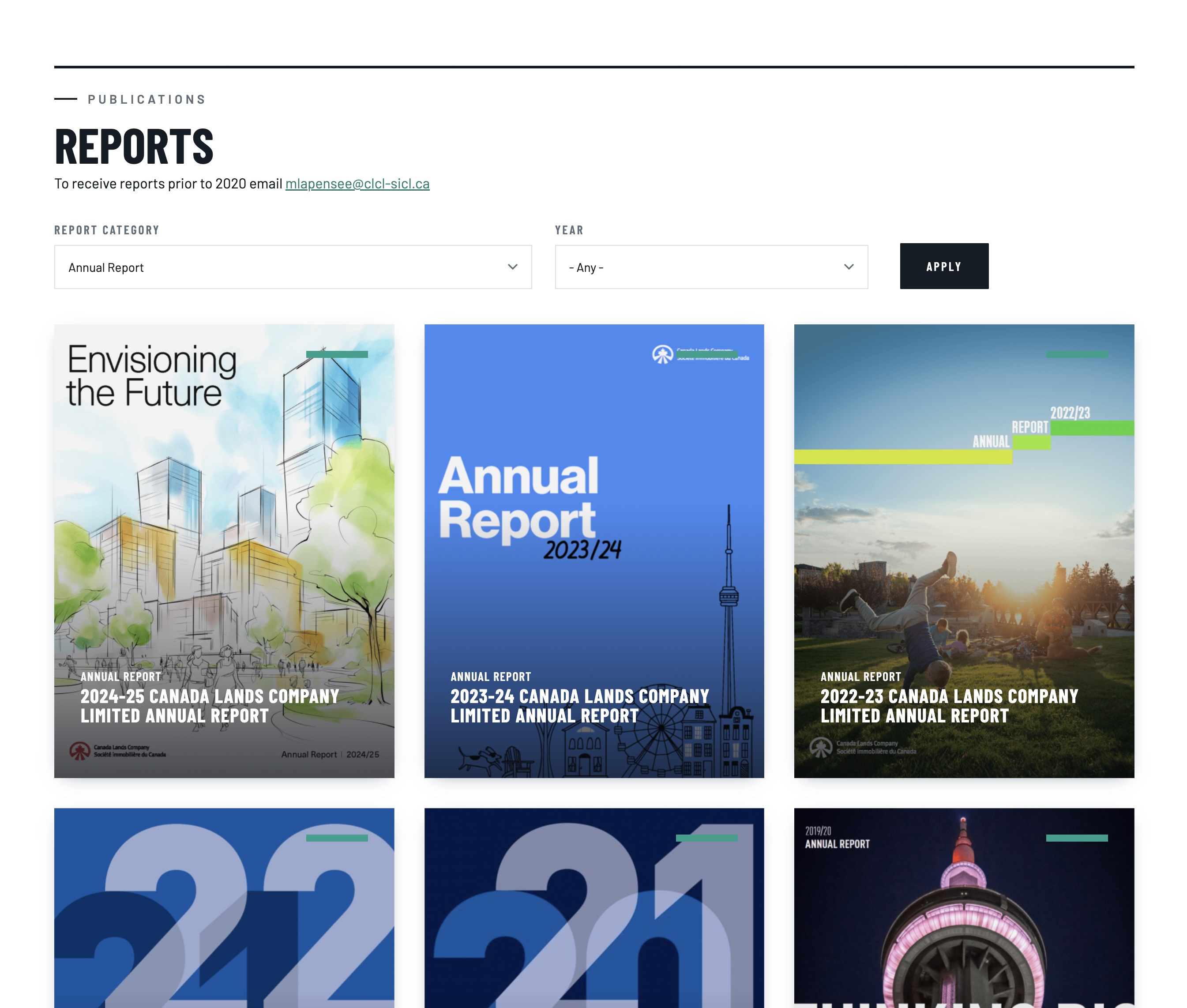
Each component is one directory — template, styles, schema, props — which keeps the front end legible and means a component can be reasoned about on its own instead of being spread across a theme. Surfacing them as blocks for Layout Builder is what turns a themed site into a system the client actually owns. That decision is what the accountability pages depend on. A Crown corporation publishes on Parliament's schedule, not a developer's, and every one of these pages had to be buildable by whoever is at the desk that day.
AI-assisted design on one end, AI-assisted build on the other. I'd like to be precise about what that actually bought us.
I used Claude to draft block and component definitions as YAML, imported them into the site, then exported the resulting configuration back out so it was properly Drupalized — canonical, versioned config rather than hand-written guesswork. Drupal's config system is exacting and unforgiving of a wrong key, and that round trip is what made generated scaffolding safe to keep. What it did not touch was the model. Which components exist, which props they take, what an editor is allowed to change, where a token belongs — those came from the design and from how the client publishes. AI wrote the boilerplate; the decisions stayed mine, and every generated file got read before it got committed.
I also did content entry, which is the fastest quality-assurance pass a front-end developer can run on their own components.
Populating real pages surfaces everything a design review misses: the executive title that runs to three lines in French, the report with no cover image, the attraction card with a logo that needs more clear space than the mock allowed. I hit those as the person filling the field, which meant I fixed them as the person who owned the component. On a fast-track project that loop is worth more than any amount of documentation. There was no time for a bug to travel between two people.