
Get in touch
Tell me a bit about your project and I'll get back to you by email.
Tell me a bit about your project and I'll get back to you by email.
Drupal 7 to Drupal 9 for the organization that funds Canadian research infrastructure. I built the front end as a kit of parts — so editors could build pages without calling a developer.
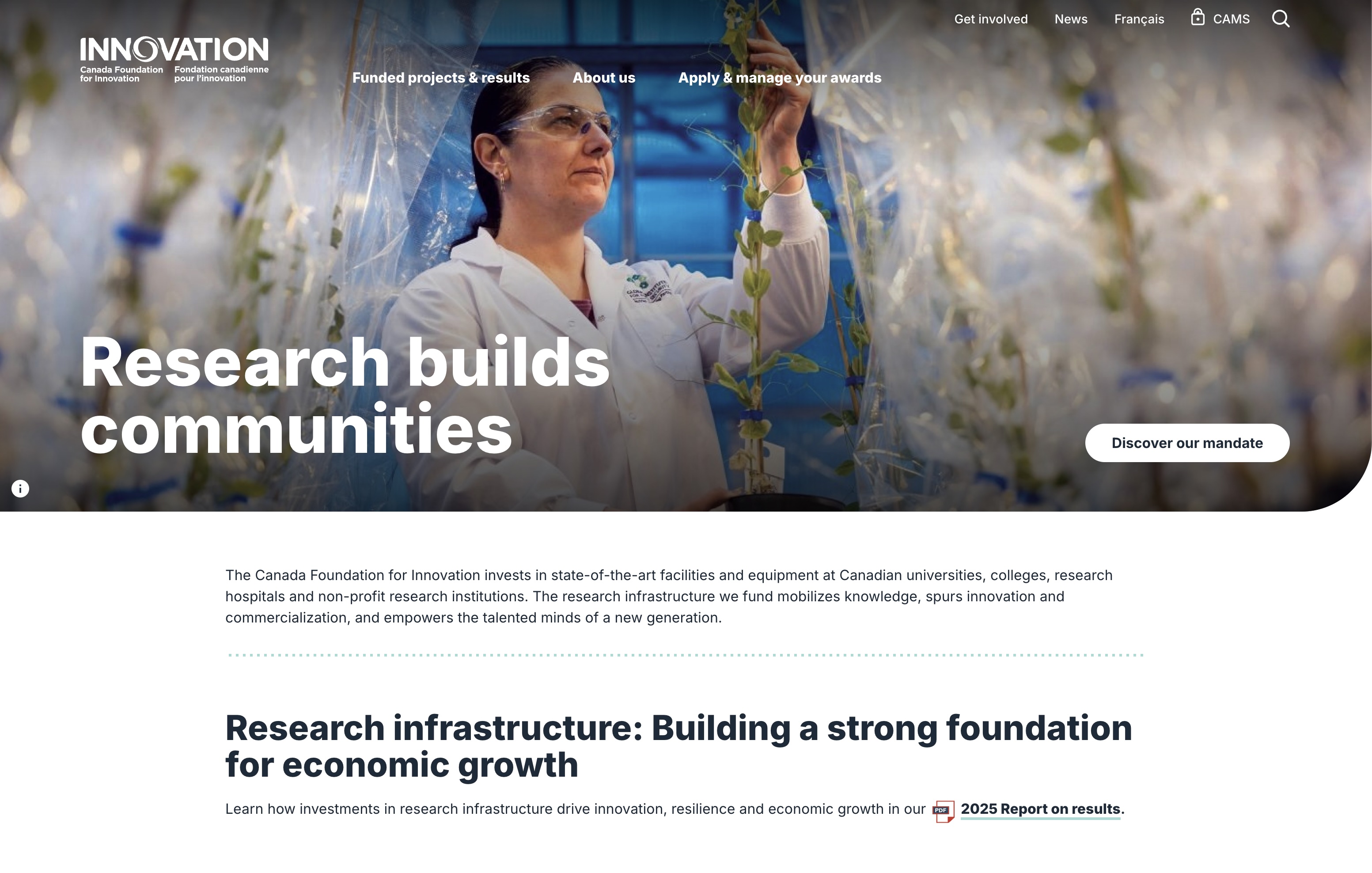
A funding body's site is a bureaucracy made navigable. Researchers came for applications; everyone else came for a completely different site.
Five audiences were identified in discovery: researchers, institutional CFI liaisons, parliamentarians and elected officials' staff, international expert reviewers, and private-sector representatives. A researcher mid-application needs dense procedural detail and needs it fast. A parliamentarian needs impact, in one screen, with no jargon. The old site had made everyone read the researcher's version. The redesign went editorial instead — big headlines, generous white space, large photography, one idea per band — and the front end had to make that hold up under content that was mostly long, formal, and bilingual.
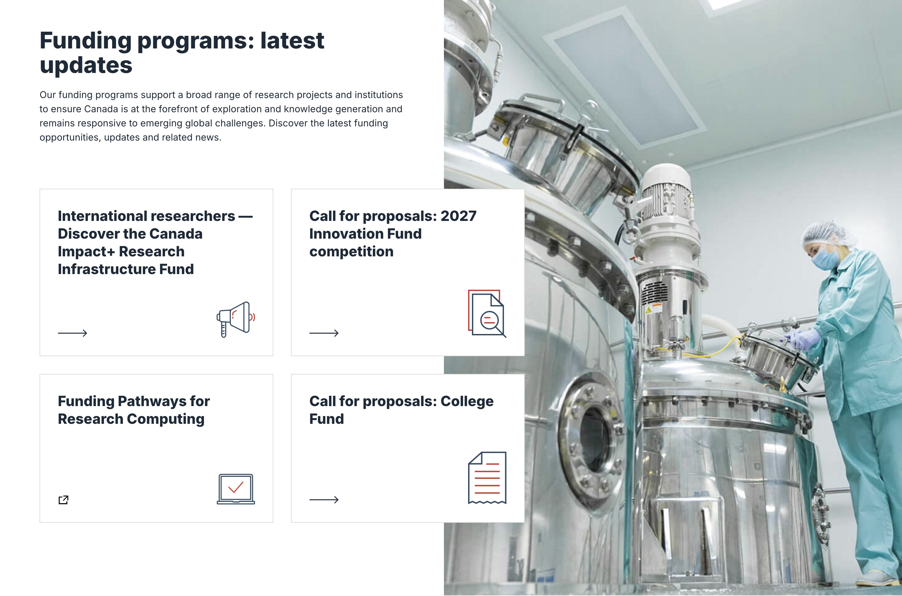
The real requirement was that CFI staff could build new landing pages themselves. That changes what a component is allowed to assume.
If an editor can place any component after any other component, then no component can rely on what's above it. Each one owns its own vertical rhythm, works on both background tones, handles a two-line heading and an eight-line one, and reads correctly whether it's the first thing on the page or the last. Practically that meant building for the awkward case first: the stat band with one stat instead of three, the card row with two cards, the callout with no image, the quote that runs six lines. Those aren't edge cases on an editor-composed site — they're Tuesday.
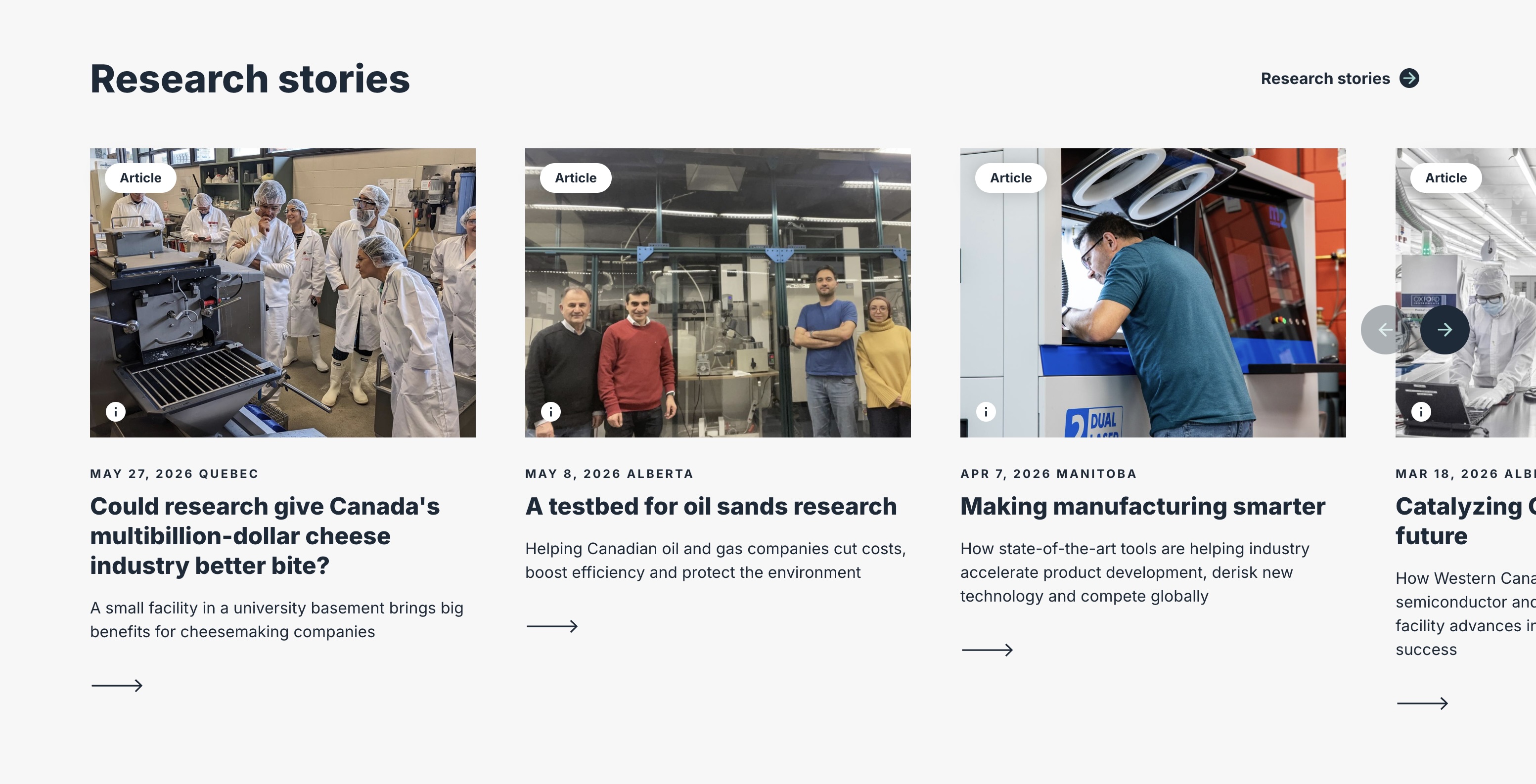
A full-bleed media header with white type over it and a curved bottom edge — three of the most expensive decisions a homepage can make, stacked.
They're the right decisions here: research infrastructure is physical, and a real photograph or a looping clip sells it faster than any headline. So the work was making it cost less — a poster frame that renders before anything downloads, and the headline sized against the brightest part of the image rather than the average one. The curve is the fussy part. It has to stay a smooth arc from 320px to ultra-wide, never crop the subject's face, and never eat the headline. And any autoplaying motion has to stop for prefers-reduced-motion — one media query, and the difference between a homepage that's impressive and one that's usable by someone with vestibular sensitivity.
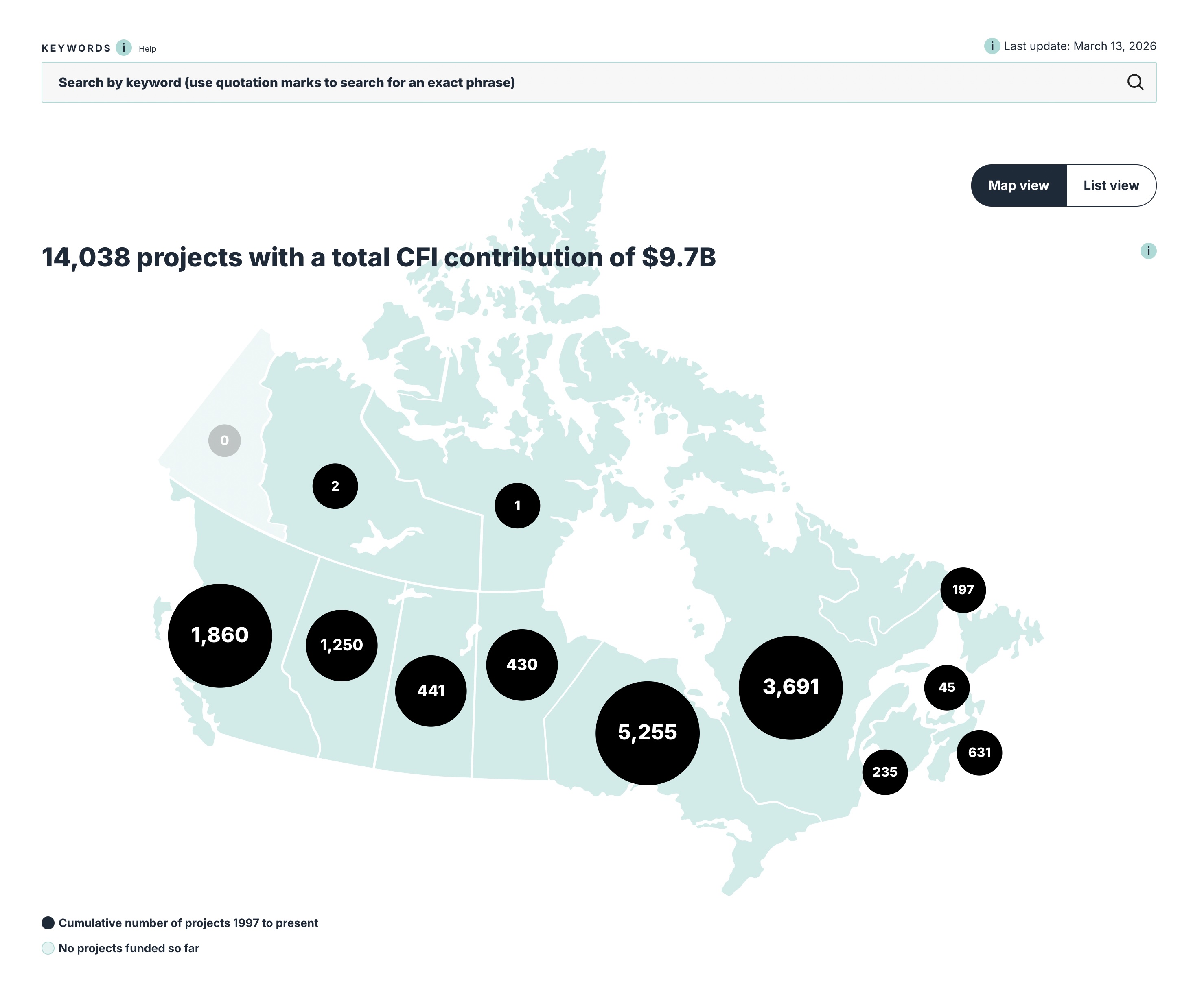
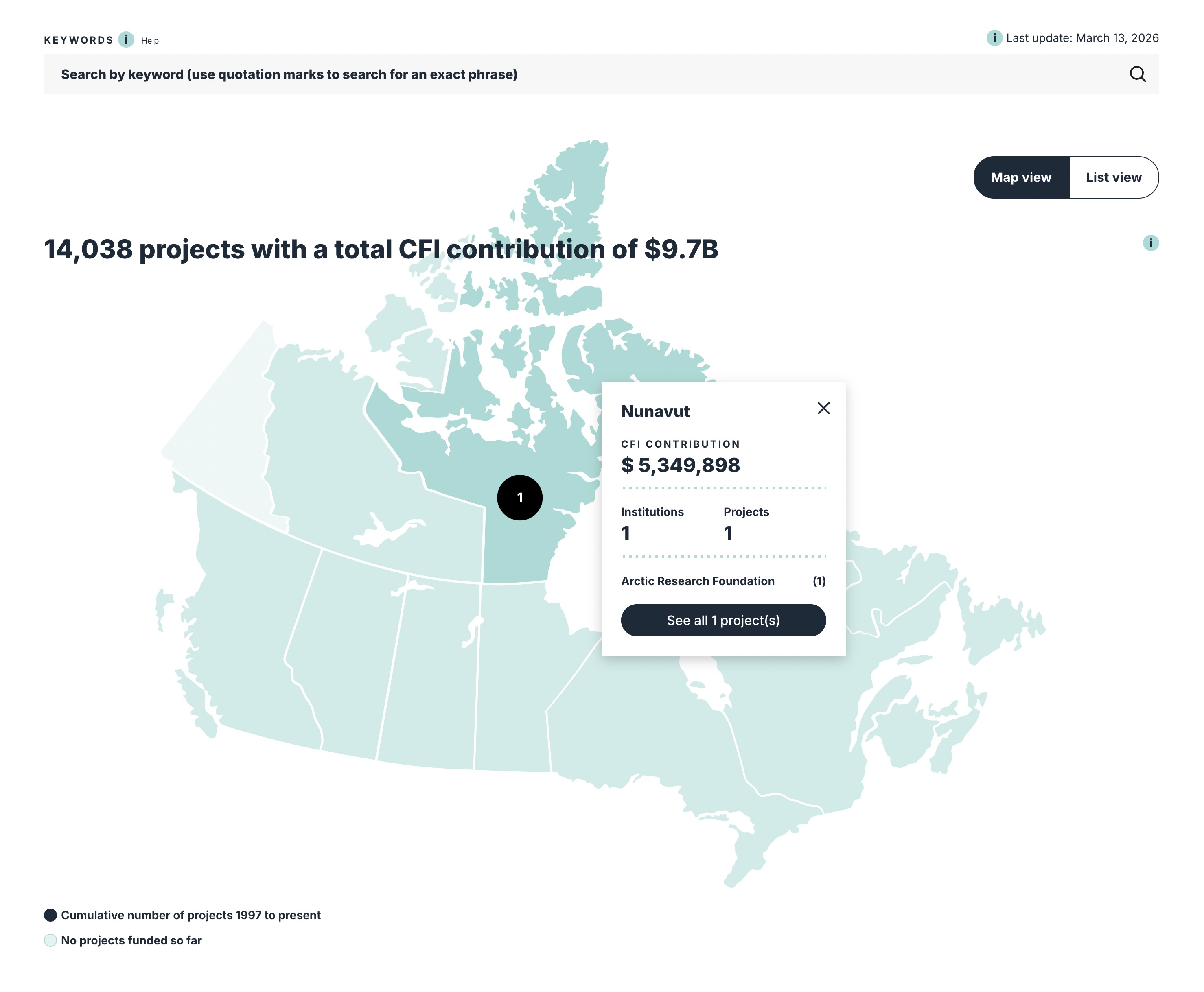
Fourteen thousand funded projects on a map of Canada. The most interesting front end on the site, and the one that can't be a picture.
Proportional bubbles per province, keyword search, a detail card per region, and a Map/List toggle. That toggle is the accessibility answer, not a convenience: a scaled circle communicates nothing to a screen reader, so the same data exists as a list, and the toggle is a real control rather than a filter buried in a sidebar. The rest is unglamorous discipline. Bubbles sized by area, not diameter, or Ontario lies about being four times Quebec. A visible legend for the two states, including the zero case. Numbers inside the circles that stay legible at the small end, and a popover that opens on keyboard as readily as on click.
Design comps show the good pages. Migration shows you the other 1,450.
Content that came off Drupal 7 arrived with fifteen years of habits in it: tables used for layout, skipped heading levels, inline colours, PDFs linked as "click here", nested lists three deep. The front end can't fix that content, but it decides whether the site degrades gracefully around it or breaks. So a real share of the work went into the body-copy styles nobody presents: what a migrated table does at 375px, what an orphaned heading looks like, how a bare document link is styled so its file type is visible before you click it. Unglamorous, and the difference between a launch and a launch plus six weeks of tickets.