
Case Study

Beneva · via Evolving Web · 2022 – 2025

Beneva

Canada's largest insurance mutual. I was a contract front-end dev on their features — and the person who started auditing their accessibility because nobody had asked anyone to.

Design

Development

Accessibility

Client

Beneva — the largest insurance mutual in Canada, formed from the merger of La Capitale and SSQ Insurance

Studio

Evolving Web — staff augmentation contract, embedded in Beneva's own delivery team

Role

Front-end developer on feature work; self-initiated accessibility auditing, reporting and remediation

Span

Two to three years, on and off, across a bilingual public site and a logged-in client centre

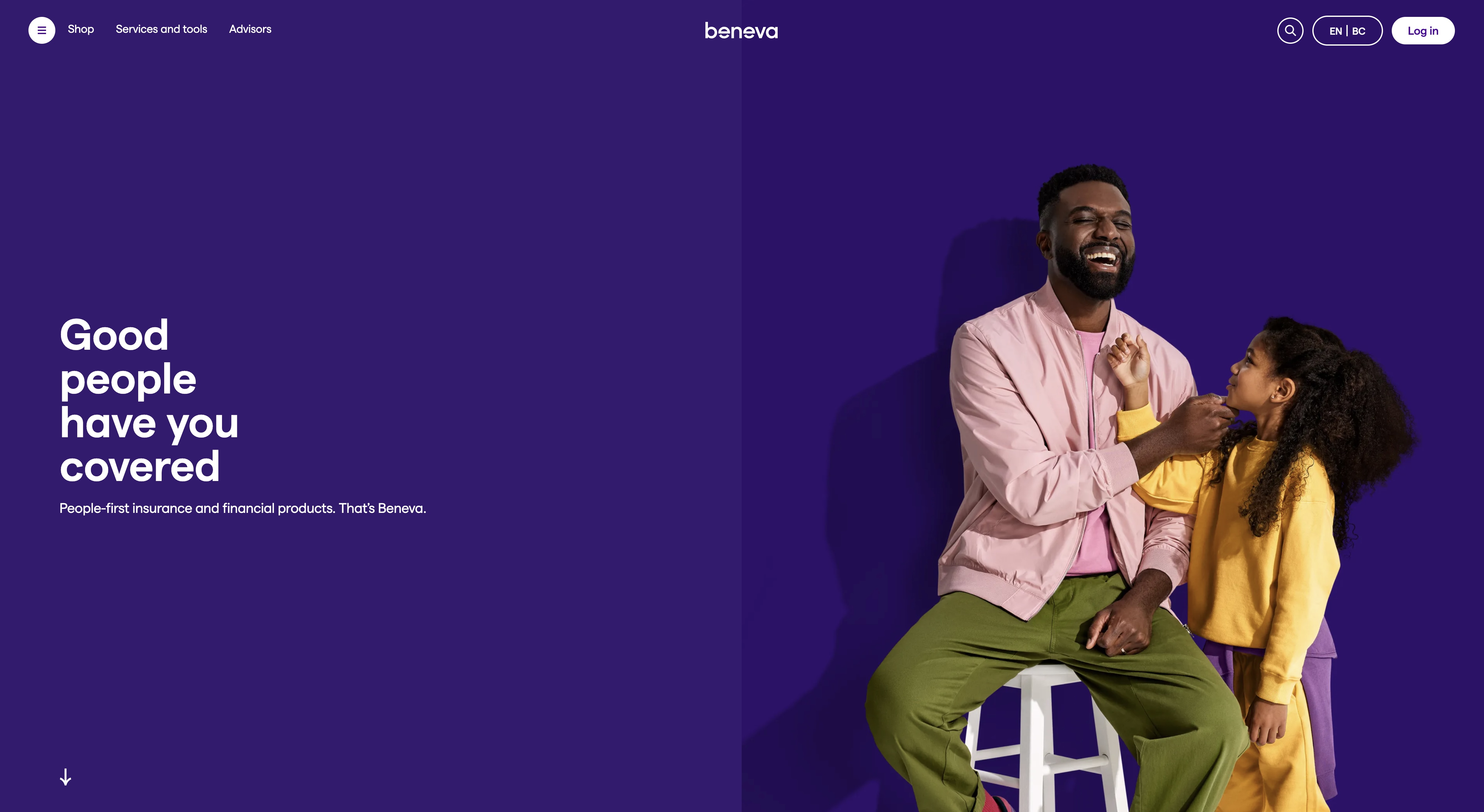
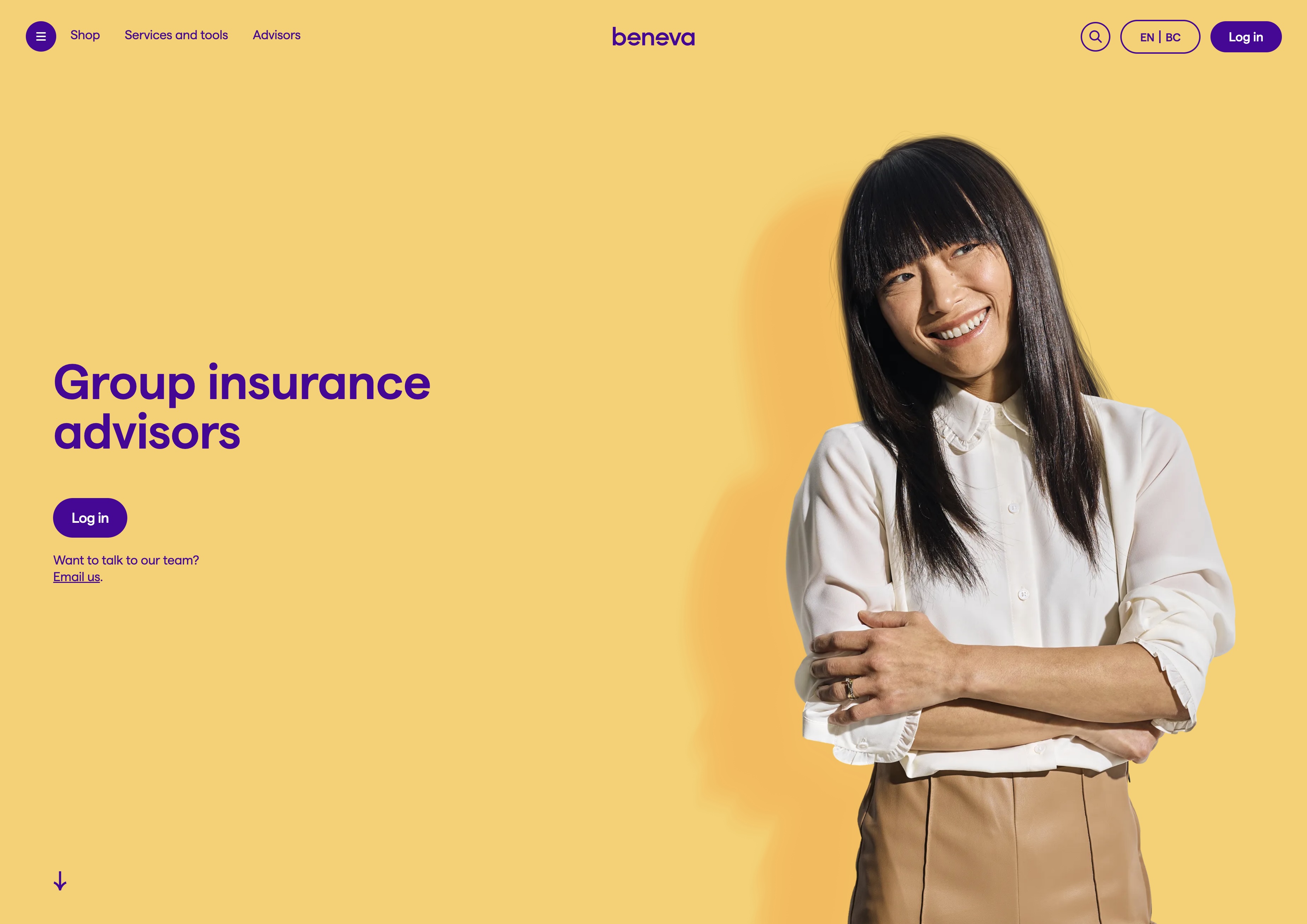
Screenshot of the Beneva website homepage — placeholder, replace with Figma export

I was hired to improve features. That is a narrow brief, and it is also the most common way a front-end developer actually joins a large product.

Beneva came out of a merger, so the site carries two histories: patterns from La Capitale, patterns from SSQ, and a new brand laid over both. My work sat inside that — navigation, carousels, accordions, forms, the components in front of a quote or a login, in English and in French. Nobody asked me to look at accessibility. But this is an insurance company whose clients include the elderly, the injured and the recently bereaved — the exact people most likely to be using a screen reader, a keyboard, or a phone at 200% zoom. So I started testing, and I brought findings instead of opinions.

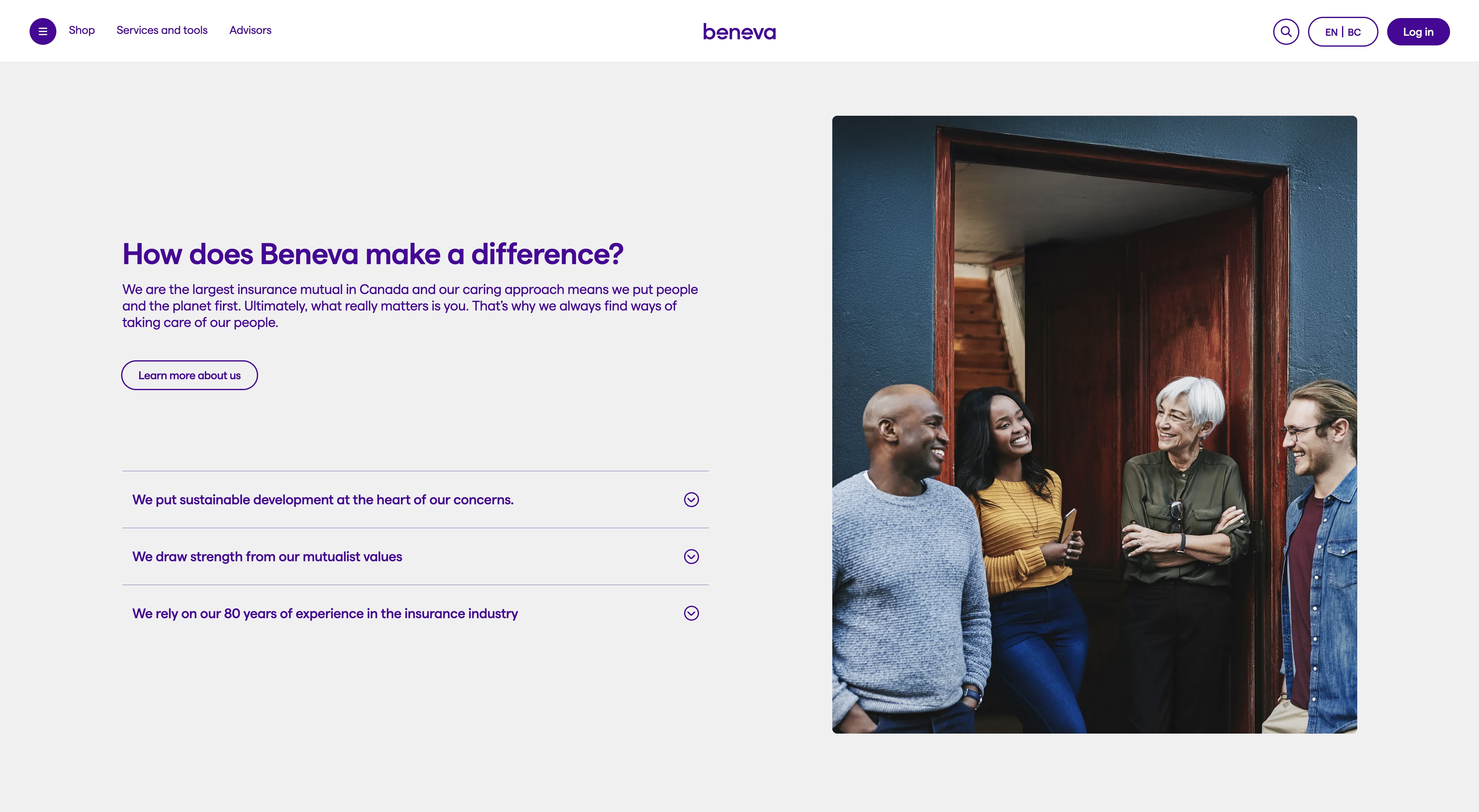
Screenshot of Beneva accordion, carousel, and disclosure button components — placeholder, replace with Figma export

Accordions, carousels, disclosure buttons — the ordinary components where accessibility is usually won or lost.

Fig. 01

Automated tools find roughly a third of what's wrong. The interesting two thirds only show up when you put the mouse down.

I ran SortSite and Axe across templates to catch the mechanical failures — contrast ratios, missing labels, duplicate ids, heading order. That gives you a list, and a list is where most accessibility work stops. Then the part that matters: tabbing every flow end to end, and listening to it with a screen reader. That is where you find out that a menu opens but focus stays behind it, that a carousel announces nothing when it advances, that a modal can be tabbed out of, or that a form error is displayed in red and announced not at all.

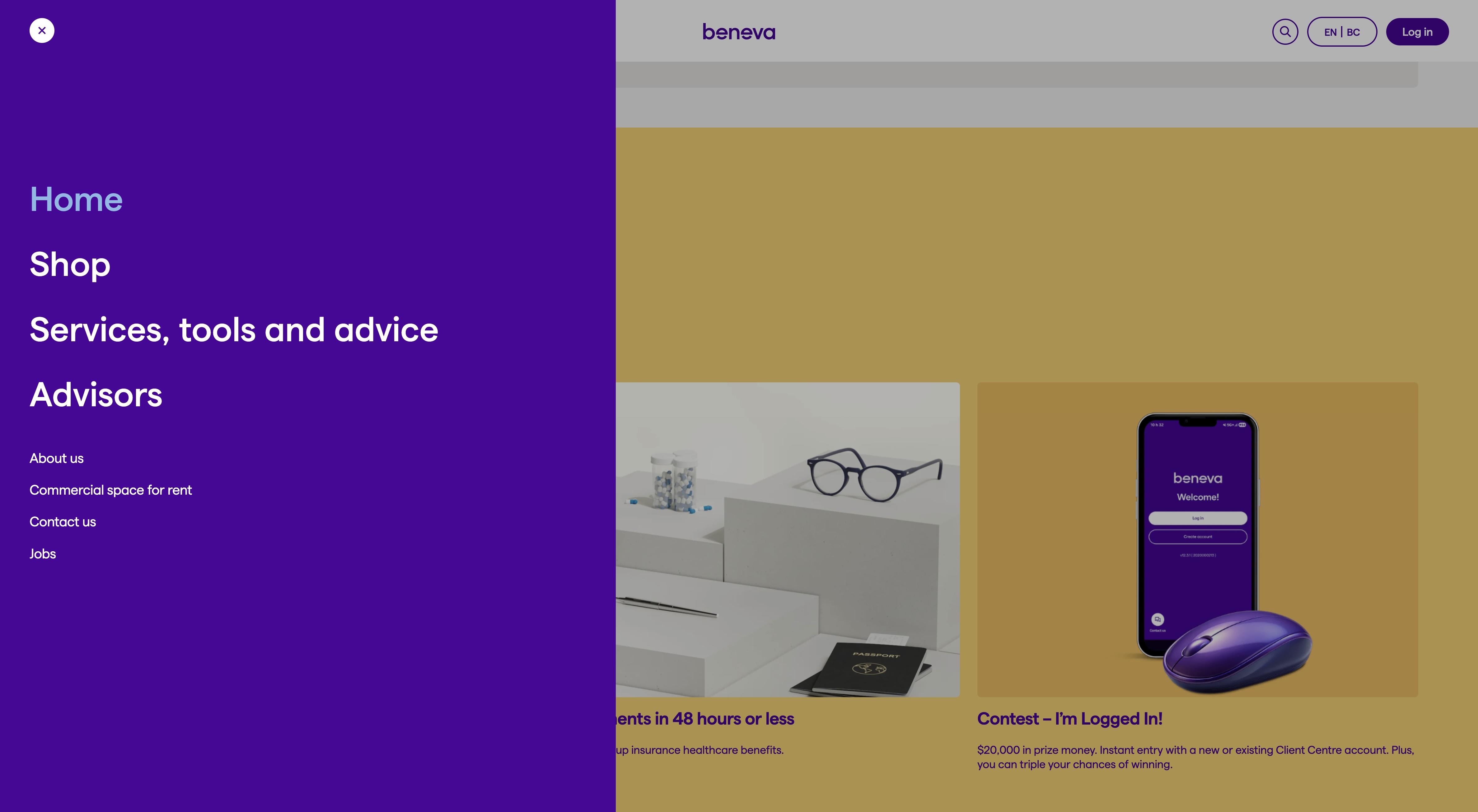
Full-screen navigation menu overlay on the Beneva site — placeholder, replace with Figma export

A full-screen menu is the highest-risk component on any site like this: it has to trap focus, close on Escape, and return focus where it came from.

Fig. 02

The four-pass audit

1 SortSite — site-wide sweep, to see which failures are systemic rather than local

2 Axe — per-component detail while the component is open in the browser

3 Keyboard only — every flow, no mouse, watching focus the whole way

4 Screen reader — the same flows again, listening rather than looking

Passes 3 and 4 are where the findings that change a design live. They're also the two that don't fit in a ticket template, which is why they get skipped.
A list of violations gets filed. A finding with a cause, a consequence and a fix gets built.

Nobody had commissioned this work, so it had to earn its place against a roadmap. That meant never handing over a raw tool export. Every finding said which success criterion it failed, who it affected in plain language, how to reproduce it in three steps, and what the fix was — usually with the markup or the CSS attached. Then I sorted by who gets blocked rather than by tool severity. A missing alt attribute is a violation; a keyboard user who cannot complete a claim is a person who cannot use their insurance. Those are not the same ticket, and ordering them that way is what got the work scheduled.

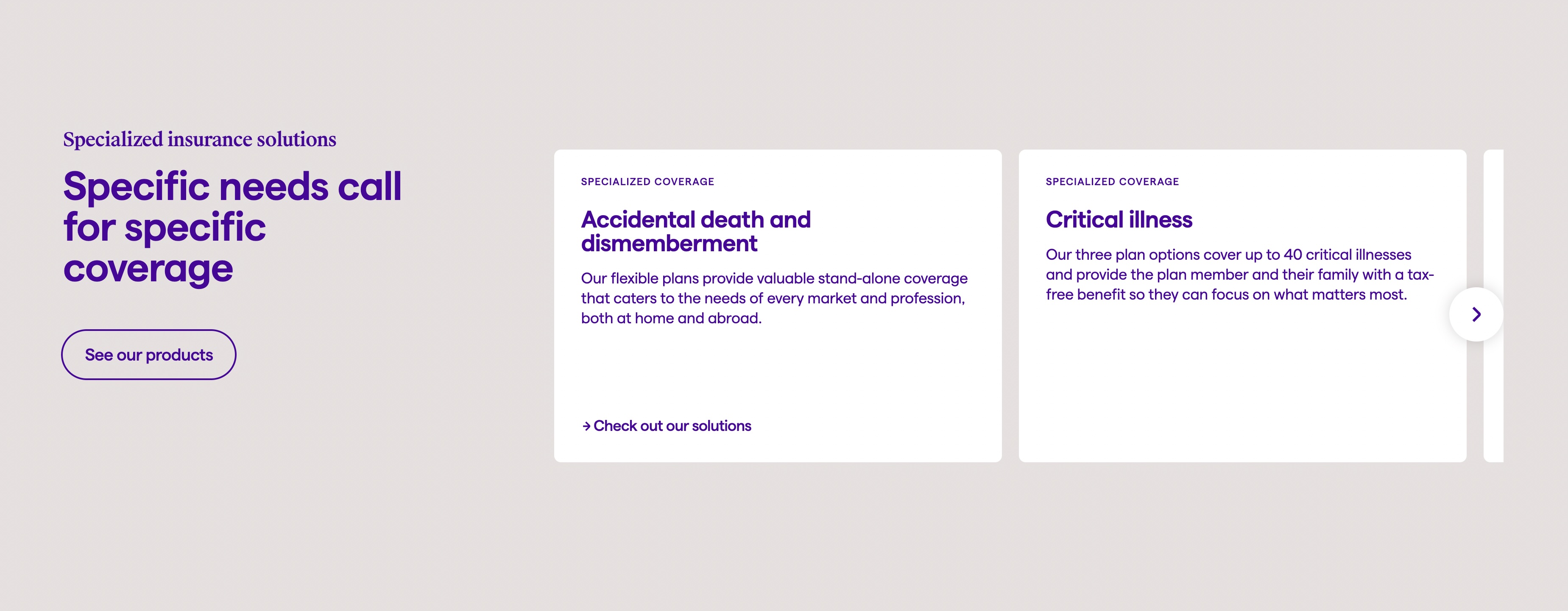
A carousel component on the Beneva site with navigation arrows and dots — placeholder, replace with Figma export

Carousels are the classic case: visually obvious, and silent to anyone who isn't looking at it.

Fig. 03

I stayed on for the remediation, which is the only way to find out whether your recommendations were any good.

Auditing and fixing are usually different people, and the gap between them is where recommendations go to die — too abstract to implement, or technically correct and visually unacceptable. Being on both sides meant a finding could come back as a real component change, tested in both languages, and re-tested with a screen reader before it closed. It also kept the fixes honest about the brand. Beneva's identity is high-contrast purple and yellow with generous type — a good starting point — but focus states over photography, French labels in tight buttons, and text on the yellow needed real decisions, not a blanket outline.

A focus ring shown on a purple button against Beneva's yellow background — placeholder, replace with Figma export

Purple on yellow passes comfortably. The same yellow behind a focus ring does not — so focus got its own treatment.

Fig. 04

Text overlaid on a photograph within Beneva's curved brand shapes — placeholder, replace with Figma export

Text over photography and curved brand shapes: the case where contrast depends on which image an editor picks.

Fig. 05